Introduction
Brand awareness relates to how many people are aware of what your brand is, for example, lots of people are very aware of what a “Disney” is where as not as many people would know what an “Intelevision” is. In short, the more people that are aware of your brand, the more money you’re going to potentially make.
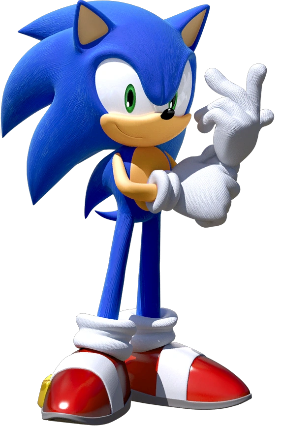
Brand awareness has a strong relation to your target audience because a part of customers being aware of brands is the customer perception of that brand. coming back to the Disney example, those guys are perceived as being very child friendly when it comes to the movies they make, where as a brand like Universal would be perceived as making films that aren’t as child friendly. (at least some of the time anyway) Sometimes two or more demographics can see the same brand very differently, for example, the Sonic The Hedgehog brand has got quite a few continuities under it’s belt, those being The Games (which according to forces there are two), The TV Shows (all 5 of them), The Old Anime Film, The Comics series (all 5 of them thus far) and now a live action movie, and on top of that, some of them have gone through multiple opposing tones and in the case of Lost World it does multiple tones at once. This means that some people will perceive Sonic as a more serious series while others might see the character as more of a light-heated cartoon series. (and that’s not mentioning the argument about what colour his eyes should) Another example is how some people perceive EA games as a money grubbing, studio killing dumpster fire, while others (mainly those not as in the loop on this stuff) would perceive them as just another game company like any other.


Graphic designers tend to do most of the work (in terms of visuals anyway) when it comes to raising brand awareness for companies such as Disney or even McDonalds because graphic designers usually design the logos in the first place (as you’ll no doubt have seen/will see in past and future visual examples), the graphic designers have to think about what they’re clients want out of the logo as well as how they’d want the audience to perceive the brand as a result.
There are many ways that one can market their product as you are about to see below these include posters, billboards and banners, mascot costumes, websites, social media pages and even company uniforms, just to name a few.


Semiotics
the term Semiotics is used when referring to icons and logos for brands such as Mcdonalds, we also use Semiotics when referring to things such as road signs and characters (whether they be fictional or not)

as you can see, semiotics are useful for many different situations and even brand awareness, which is important if you were, let’s say an animation studio trying to get off the ground with your first movie, before you even begin thinking about making your movie you have to decide on what you want your logo to be. as such you’d have to make a lot of important decisions about things such as the colour pallet, the font and in this case, what your mascot looks like, luckily for me, I happen to have made these key decisions when making the logo for Slamination Studios

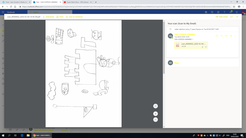
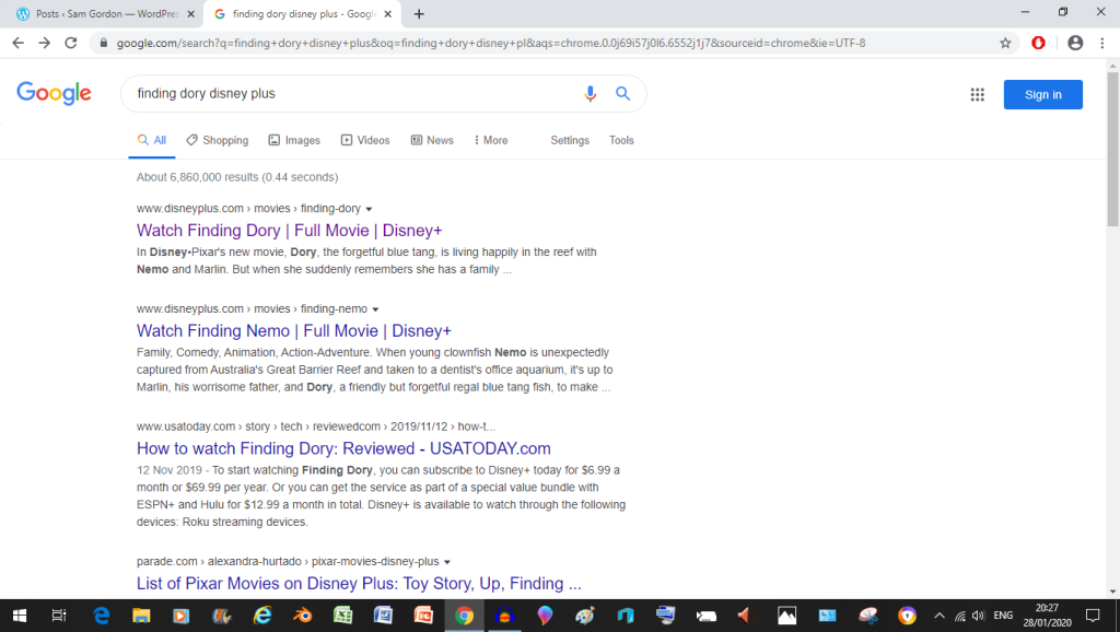
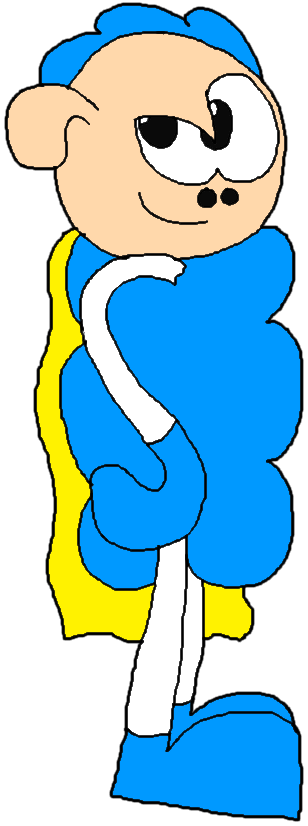
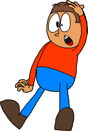
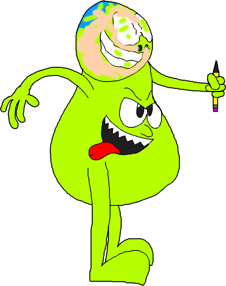
now, you could look at characters such as Super Sheep and Guyzo (as well as everyone else on this blog’s front page) as examples of semiotics because I use them all over the place all willy nilly, which in turn means you see these guys more and more and that in turn will make them stick inside your head more easily (so in a way, I’m getting these characters into your heads now before I’ve even properly written the first Super Sheep Movie), We also created some semiotics of our own to see if people could recognize what they depicted (stuff such as elephant sanctuaries and the like), take a look
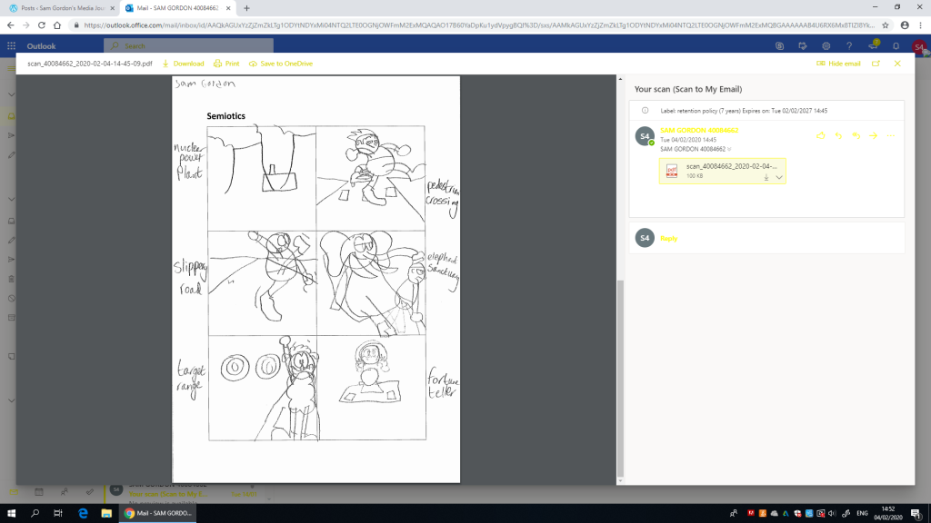
as you can see here, even with my rough sketch, people were able to recognize what they depict, this tells me that I’ve got the skills needed to create various signs and that all I’d need to do to make them better is to clean them up
We also drew up some semiotics while watching a gameplay video of Super Mario Bros for the NES
here are my results in this task
How to Social Media market correctly
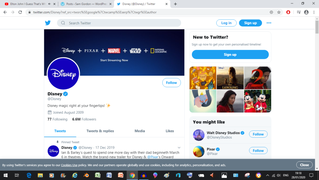
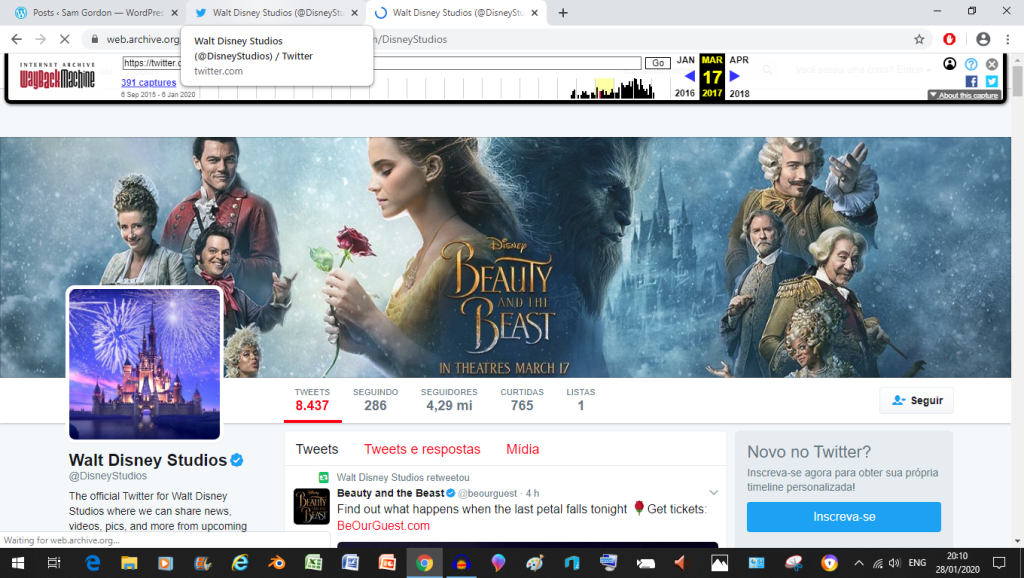
now the example we’re going to use here is for the Walt Disney company’s social media profiles but a lot of other movie studios do this too, what I’m talking about here is the way a company will typically change their header to relate to a new product of service that they want to push at the moment
Sometimes disney will of course change their banner from time to time to promote a big release or two, but they take a slightly different approach that would make this approach on top of that, you’ll see what it is after I show what I mean in these Wayback Machine archives (which you can visit yourselves by the way)
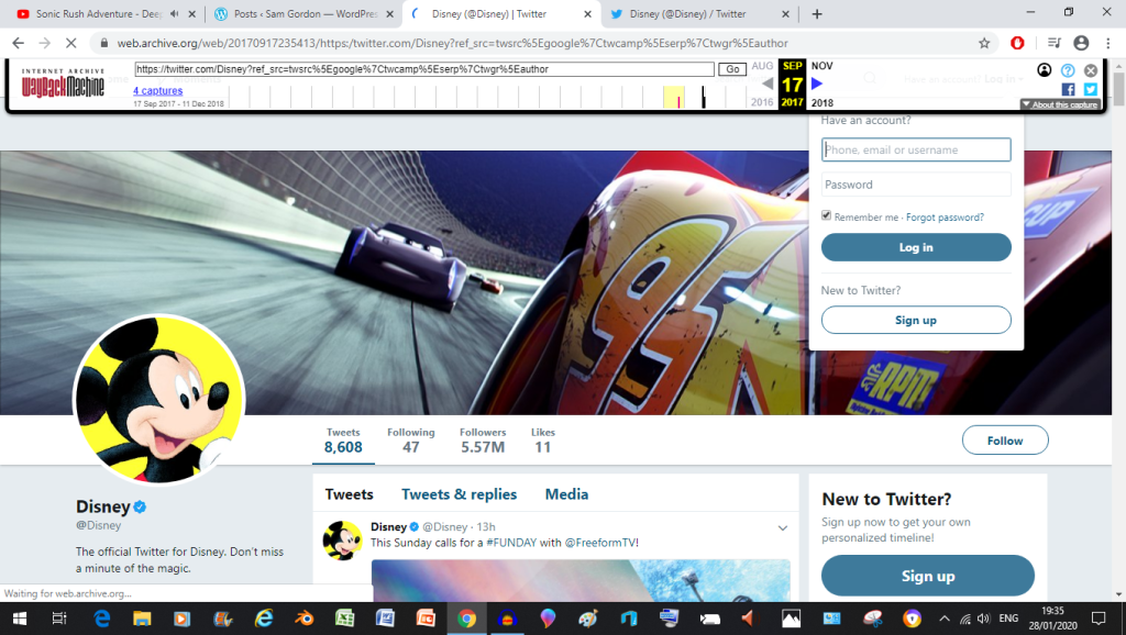
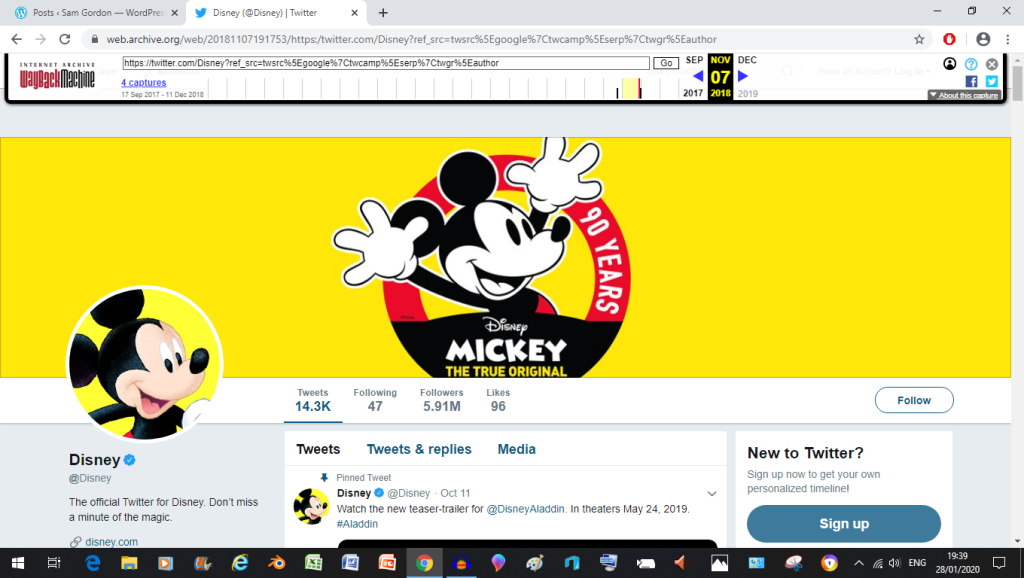
More examples of them changing the banner over time can be found on the Disney studios account

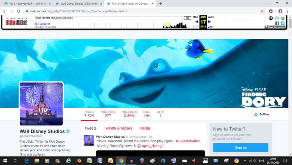
but the main thing is that they changed the banner to be Finding Dory Themed to promote the then upcoming release

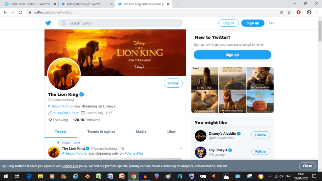
now what do they do to supplement the Bruce banners? well they’ll flat out make specialised accounts, just to promote a movie franchise, that way the main account can focus more on promoting Disney as a brand and less on promoting just the movies (besides that’s what their also fairly general Walt Disney Studios account is for)
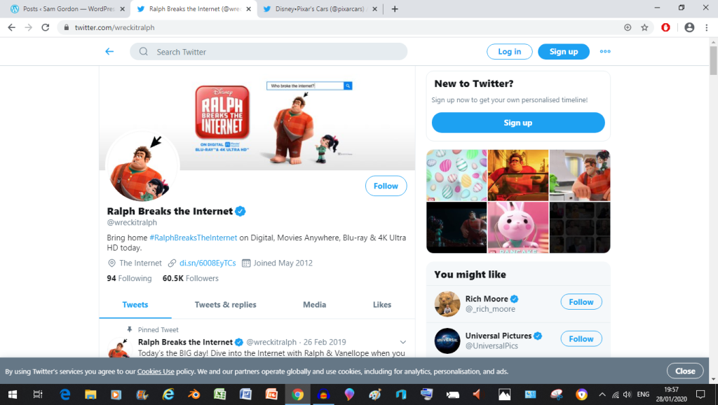
another thing they’ll sometimes do is cross promote with other properties that they own, as seen in this playful conversation between a parent and their subsidiary

this not only creates a playful tone, but it also tries to make the audience chuckle with it’s seeming inability to find Dory (which might just convince a fan of the character to want to try out this service)

What Do I want to make for this project?
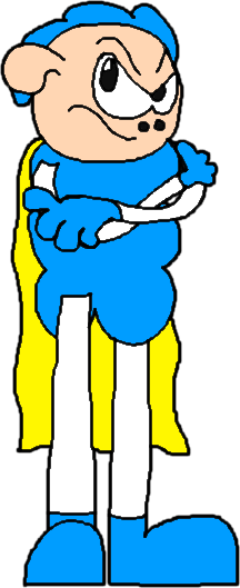
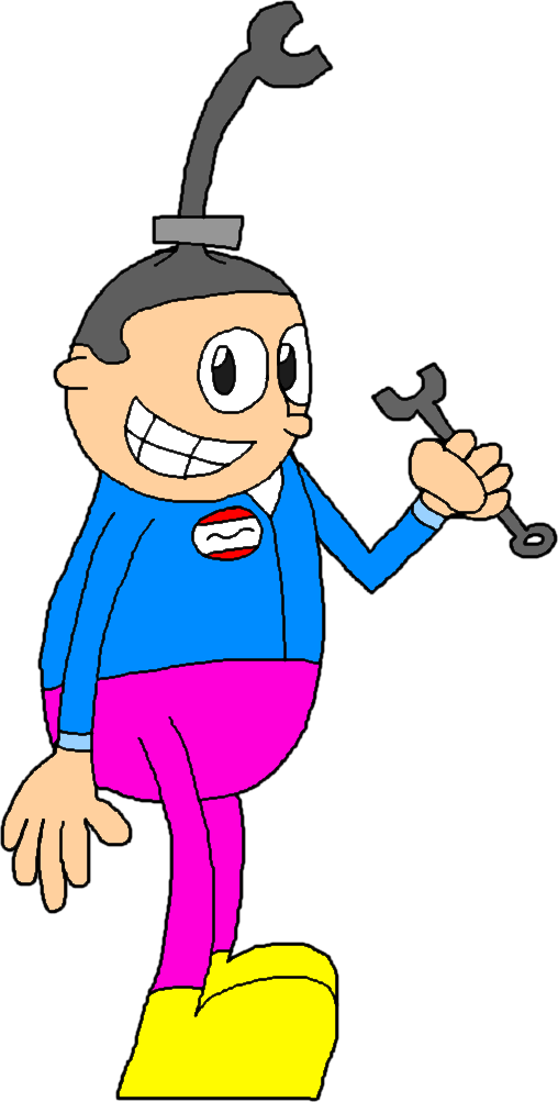
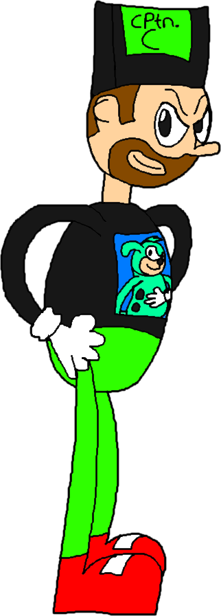
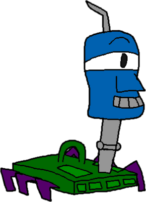
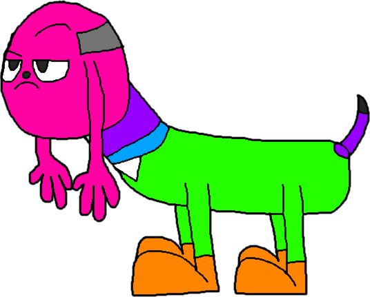
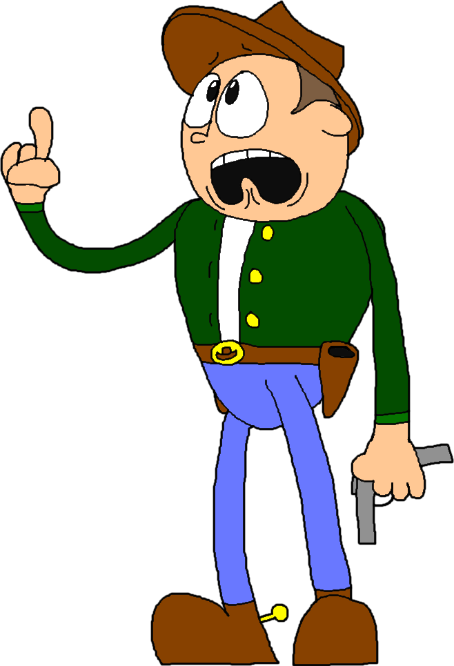
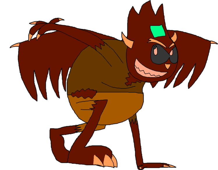
One Idea I have for this project it to create a massive billboard that features my main characters (I.E: Super Sheep, Guyzo, Captain Cartridge Ext) but they’re all silhouettes (which means it’d be time to make two versions of this) so that when they eventually get revealed people end up going “whooaaaaaaaa!”
so while typing that first paragraph I had the zany Idea to do a video poster instead though that one is a maybe because with my inexperienced nature that may take a while (doubly so if I make it animated), essentially, the video poster would consist of the same concept as the original Idea except they’re actually moving.
As a direct result of the problems I’ve come across with the animation idea I came up with the Idea of a halfway point between the two previous Ideas. (where the characters are static images but they all get revealed one at a time)
Me and The Boys getting featured on a billboard:


Right, Come on, It’s Billboard Time Boys
Now, billboards are a wonderful piece of advertising kit. Why? because of how versatile they are when it comes to the ways and places you can use them in, from the typical roadside to the side of or even inside a building. Heck the Digital technology used in tv billboards allow you to have multiple ads cycle through on one billboard


Companies use Billboard all the time to market their products, whether they be a film, game or even burger joint because they’re not specific to any given industry unlike a TV advert or even social media marketing, as seen during the first two example billboards above this paragraph (although the second one is advertising the Ad Space on this billboard so who knows if it even counts here)

This Billboard advertises Sonic 4 Episode 2 (not really the best one in the series but hey, it’s better than episode 1), here they show Sonic and Tails (who were both present in Sonic 2) flying over the background of the first level in the game (and thus showing off one of the game’s tag moves), the game’s logo is meant to invoke the classic Sonic style that was present in the 90s (even though the characters use their modern designs which to me, seems to clash with the 90’s nostalgia they’re going for in this two episode saga)


you can also see the SEGA logo in the bottom right corner to let people know who actually made the game, even though DIMPS are the ones that developed the game, SEGA are just the publishers and Sonic’s rights holders.


Ok so this is a really weird billboard campaign for a film, they’re billboards for the Grinch 2018 movie 2 years ago (with it’s November 9th release date and the studios logos situated on the bottom) but they take on this weird, almost condescending tone towards the audience, as if the Grinch himself was making these inane billboards, I think it is clever in a sort of, unexpected way as the grand majority of other marketing campaigns like this don’t typically sneer at the people viewing the page (whoever came up with this campaign deserves a raise for sure)

These billboards also relate to the audience as some of them describe situations that they’d typically find themselves in (this one talks about what sometimes happens when the traffic lights turn green, but he’s saying he loves it because he’s the Grinch)
One problem with taking on this mean tone in the marketing is that it is easy for someone who’s talented enough to create a very convincing fake as you are about to see in the image below (although the fact that people are talking about this would make more people aware of this Grinch Movie)

So yeah… that was an interesting recent campaign now let’s move on to something older and more conventional (and not as easily faked)

dag nabbit I said more Conventional, not less, oh alright let’s do this. So this is a campaign that Hot Wheels started back in 2010 where they took the scaling of the real world and essentially went “yeah, that’s cool. but what if we’re Hot Wheels”
So I just had the Idea of sticking the characters in live action settings (alla Roger Rabbit) suggested to me by this unit’s leader, I’m honestly surprised I didn’t think of this first because I think it might work as an add on to the reveal of the Characters as it will also allow me to express these characters’ personallies and not to mention it will also give me an opportunity to include other related characters, like these guys:


oh, and you’ll also see the Characters from the fantasy unit get used here too (think of them as being like DLC being added on to the main game), and if you’re wondering who this DLC pack contains, it encompasses these guys:


(although they might not necessarily look the same when the time comes to making these billboards)
Why frame Roger Rabbit?
now that I’ve cleared all that up, let’s discuss the effects of who framed roger rabbit for a bit. (this may sound unrelated at first but trust me, it’ll all come back to my Campaign)

anyway, Who Framed Roger Rabbit is the story of a bitter detective name Eddie Valiant, who’s help is begrudgingly enlisted by Roger Rabbit because he got framed for murder, and so they have to find out Who Framed Roger Rabbit. (ha, he said it, he said it)
What makes this film stand out amongst it’s contemporaries at the time (that being 1988) was it’s impressive blending of live action footage and hand drawn animation in the same environment, and I’m not just talking about the characters either, but the way they interact with things
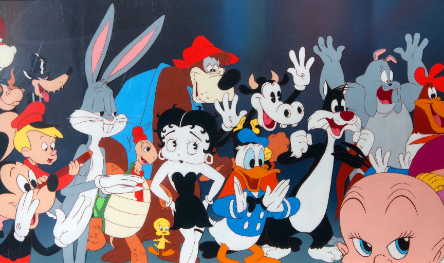
Also they got all these people to be in it:

Now you’re probably asking two questions, 1. How’d they do this amazing blend?, and 2. How’d they get Looney Tunes in the same film as Mickey Mouse? well I’ll answer the second question first because it can be summed up in 2 words: Copyright Negotiations. (which stipulate that Bugs and Mickey for example must have the exact same amount of screen time) Now that that’s out of the way, it’s time to answer question 1.
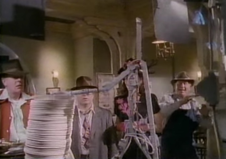
To achieve their amazing blend or real and animation, the crew had to maticulously plan every shot down to the last detail (I.E: Camera Movements, Prop Placements, Prop Movement, What the cartoons’ll be interacting with, the lighting Ext), then they go film the whole thing with some on set stand ins for some of the characters (I.E: Roger and a Weasel)

after that the stand ins get out of the way as they re-do the scenes without them, and depending on the scene you’d find yourself working with spitting robots, Plate smashing Robots, guns (and other objects sometimes) on strings and even windows engineered to break in a certain shape


Does anybody understand what this duck is saying?
and by the way, look at those stools go

after all the filming for the film is done, then it’s time to bring in the animators (which includes the late Richard Williams, rest in piece man) to go ahead and draw the characters on Cels that go over the live action photography (because Animation works in frames, the live action pieces have to be converted into pictures)
after that’s done they hand the cels over to ILM, AKA Industrial Lights and Magic (the George Lucas company), so that they can add in elements such as shadows, highlights and the works and then the whole thing is sent back to the animators for approval and after a round of Voice acting and some editing, hey presto, you have one of the few brilliant live action animation hybrids out there, the others in my opinion being Looney Tunes: Back in action, maybe Space Jam and definitely the Detective Pikachu movie (We’ll see what happens with that new Sonic The Hedgehog movie)
Heck, the animators of this film even coined the term “bumping the lamp” to describe when something really goes above and beyond. (as this film did) “Bumping the lamp” references that scene in the film where Roger and Eddie are in the dark room with the swaying light, this is because they had to work really hard to keep the characters consistent in that environment (and it was a nightmare for the ILM team to do the shadows and highlights for)
and that’s not mentioning those rare instances where they actually needed to have Eddie be an animated character (those animated Eddie only last a few frames each so that you don’t notice it)

and there is even one point in the movie where Eddie has to go to Toontown, for this part, the roles end up being reversed as it’s no longer the cartoons that need to look like they occupy the real world, it’s the real human that needs to look like they occupy the cartoon world
now this part of the movie was achieved with a combination of clever camera trickery, a couple of real props and a little good old fashioned blue screen as seen in the comparison video below
you may notice that some parts of the blue screen version change into the storyboard (and in one case even a pencil test) for the film, another thing you might have noticed is that the parts that become the storyboard also correlate to the parts that don’t feature Eddie at all, this is because for those pieces, they just needed to animate those parts without the need for blue screen (because again, no Eddie needed)
Now how does all this relate to my ad campaign?
for my Ad Campaign (which I’m thinking of calling reality slammers) after the character reveal poster I plan on doing stills of characters created by me in real life situations (although it’s probably not going to be as good as Roger Rabbit), which I actually did do a little bit of before coming to college officially, wanna see em? well here ya go
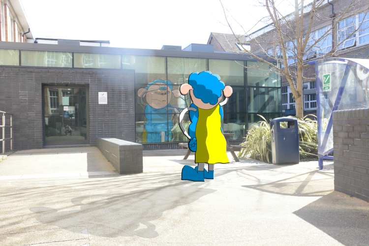
Where is that pesky man that makes 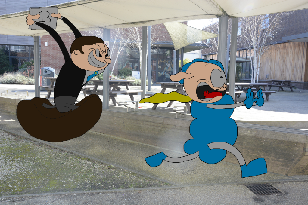
Ruuuun, it’s article 13! 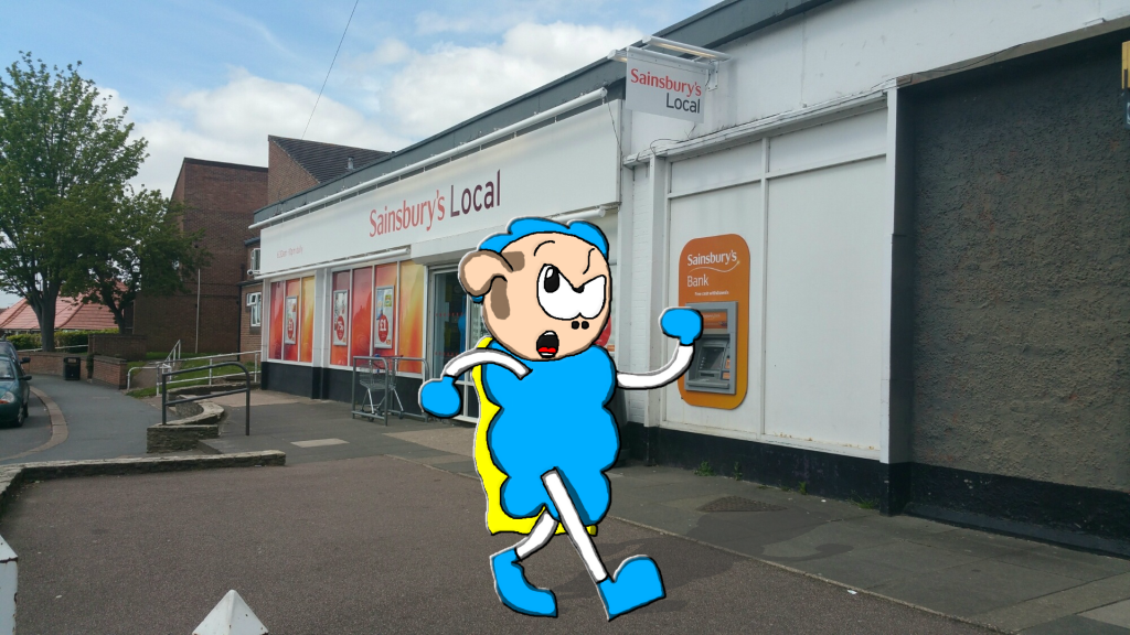
is the man that makes here? no? well fiddle sticks 
SHAAAAAACHS! 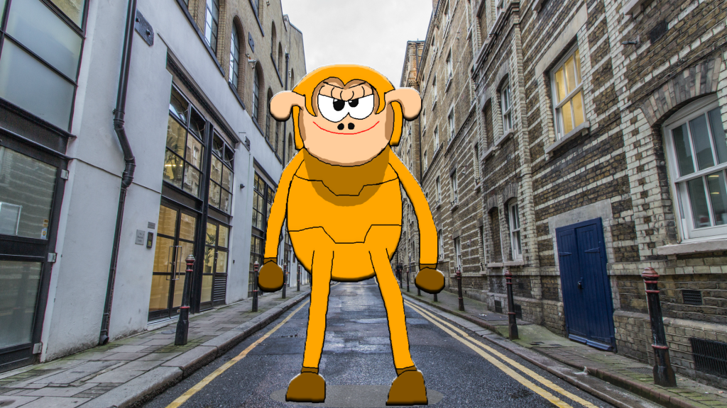
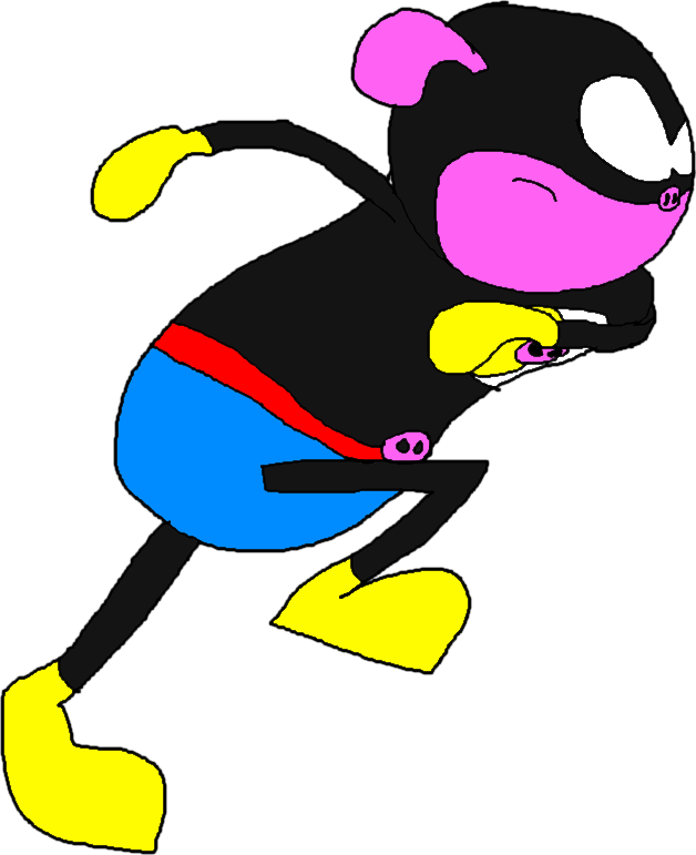
Lorange and the city streets 
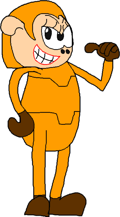
I blew up the world Supes, I’m Nuclear Hex 
In a minute Supes I’m Tired 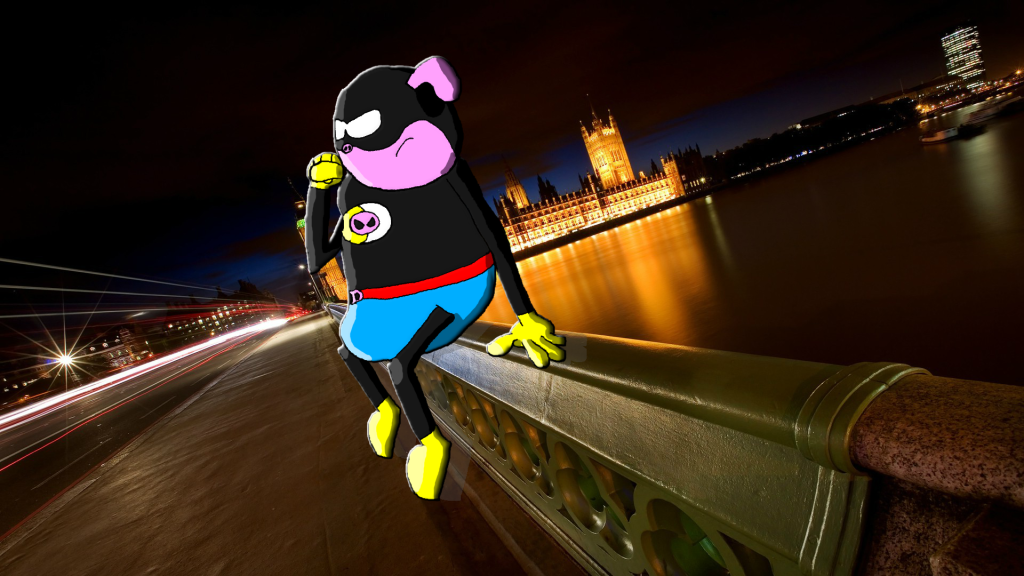
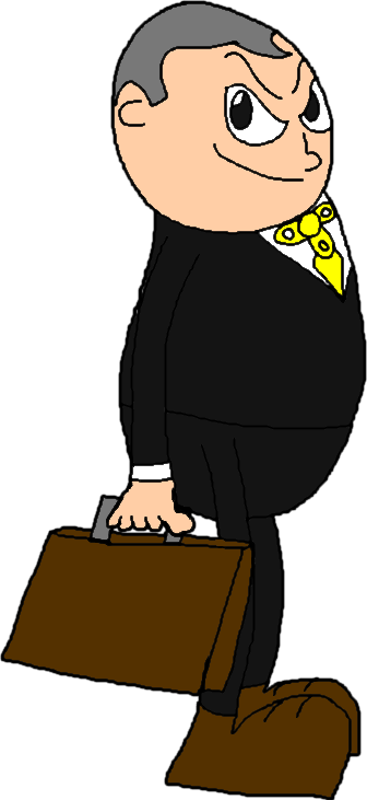
Why do we keep getting lawsuits? Why’d they kill Lorange? 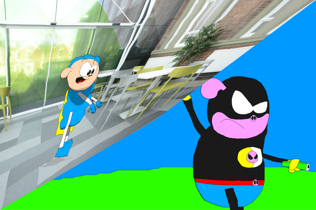
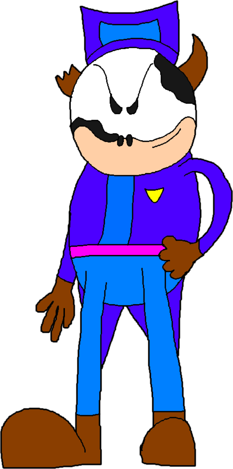
Getting meta there are we?
Now, obviously I can’t just submit these and have that be that, because they were made before college (and some of them use images from the net) so I’m gonna have to get that thinking cap on fast and start thinking already
