Right, now that all that design work is taken care of it’s time to get that website in order
The first thing we’re going to do now is open up Wix
huh, what’s this?forget the transparant video nonsense, it’s probably a premium feature anyway now let’s gook, let’s just pick other and hope we can do the quizsorry son, we’re gonna do this ourselvesoooooh dude no way, they have blanks? sign me up Jimnow to bring in my background for the home pageI might as well get every element I need all at once and have it over withwell then, looks like I can edit the footer, that’s goodlook at all the text toolsok, yeah I’m really digging this so farok, cool, just need to fix the crop outta this image and we’re goldenuuuh, noperhaps I could animate these pictureshey, why not let’s do thisI just testing to see if it supports MP3so it seems like they work although I would like to see if I could get them to play automatically (don’t worry, this file’s just experimental, the real files will come in later)so I’m doing what I can herewhat is this a button?This might make a good characters button when I figure this thing outI did a flop aroundduplication my dudesand we’re just setting up a link so that the home button can link back to this pagePage Transitions? well this’ll be interesting
Now, considering the fact that I can alter the header and footer of the pages at will, I might be able to fit more than one question on each page (though this would mean deviating from the mock layout quite a bit, so there’s that to consider)
now anyway let’s add those other pages dang it (don’t worry, we’ll come back here)right, let’s test if pages can actually have different backgroundsyes……they canhuh, group-able elements, that’s actually pretty neathey, I accidently discovered that I can pin things to the screen thanks to a janky mouseand yes you can link to pages from textI found a glitch in the matrixso for this section I had a pretty nifty Idea, what it I used a different font for each word to reflect each character’s styleyes Jeffery, we can add those links to the pictures too (this’ll facilitate some sneaky Easter eggs)here I am previewing what I’ve got so farDrat, if only I knew you could add videos as a background on this thing, maybe these backgrounds would have moved a little bit (maybe if I have time at the end after I get dreams: the full game)and just like the hero section this part uses multiple fonts to reflect the nature of the characters, this time however it’s the villainsSo I found a cool new font that I think reflects the Drawgax better than the original font I was going to useand I can do sub-pagesRight now I’m having every image of each character link to the page of said characterand the text too
Now that I think about the possibility of multiple questions on each page I think that might be a bit too much for me to chew within a month and having one question on each page will allow me to just have the correct answer link to the next question while the wrong answers will link directly to the losing screen and also to save on having a ton of duplicate pages I’m thinking about just having the right answer link you to the next question and having one big winning screen rather than going to a “you got that one right, now on to the next one” which you then have to click the next bit to go to the next question.
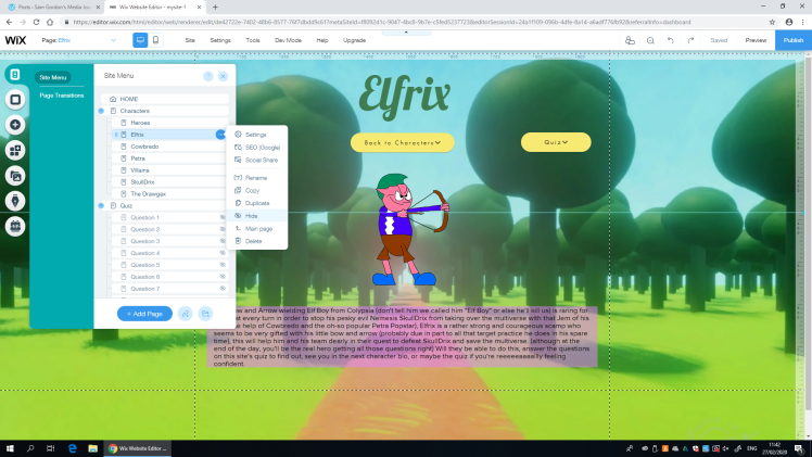
Now that that’s all been addressed and the links have been set (for the characters anyway) let’s get to work on those character pages themselves (and thus keeping in mind the clues that’ll come up when I do the quiz later)
so for these character pages, I’m probably going to end up mostly sticking with the mock layout (I mean, that’s what they’re suppose to be used for isn’t it?)you know, I think this might look better with the name above the picture because it leaves more room for the Character Bioso Now I’m breaking out the shapes for these biosbut it looks like I’ll have to add the text separately (unlike a program like word)now, with these Bios I want them to be humorous (much like I am in reality and these inane blog posts)now here I’m preemptively changing the shape’s colour so that it matches with that of the character, just thought it would look nice if the page about a specific character was themed around that character you know.and furthermore, the text will also match the character’s colour scheme (just a different colour this time)you know what? we’re pulling up that word document to use as a reference to help write out these bios, two items at once babynow here you may notice that I’m also giving the descriptions a rather demeaning tone, I feel this will add some 4th wall humour while deprecating on the characters and you the visitor to a hopefully, playful extent (I’ll admit it, I was inspired by Rayman 3’s characterisation of Murfy (given the 4th wall jokes and sarcastic jabs at the visitor and characters)
I think writing these character bios is going to be rather fun (even though I didn’t quite plan them out like I probably should have though the clues should hopefully give me enough of a baseline)
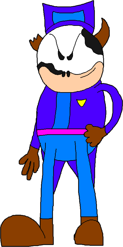
Now here I’ve made the box smaller to fit the content of the description, the reason I even made it bigger in the first place was in case I had more material than I ended up with here (I might get more material later though)yes jeffery, we did it (for now anyway)now in the case of Cowbredo, I don’t think a forest will fit his whole cowboy motif, so I changed the background to something more fitting (the same will go for Petra and the Villains too, just saying)and here we have me doing the same thing I did thing I did with Elfrix (changing the colours of text)but now I’ve decided to copy the “template” over to the other characters and make changes (I.E: Fonts, names ext)Now here I’m choosing to replace Petra’s image with that of SkullDrix to save some time deleting her and putting SkullDrix inok, forget what I said about the other font earlier, THIS, will represent the Drawgax best
We interrupt this program to bring you yet another project management update
Well now I’m getting to the point where I’m no longer a stage ahead because I’ve planned it so that I spend this time doing the website (which I’ve already been doing for some time now so I’m at least somewhat ahead)
Ok, you get the gist at this point, back to the program
so this is my plan for this session (which to be honest I’ve already started doing before scanning this in)now I think that my approach of always having the questions beside the character bio will help me keep the bios on track (while at the same time making sure that you have to infer the answer from the clue) as you can see from this development screenshot, I’ve written up a piece of his bio with the help from the question sheetthanks to this question sheet I was able to write what I think is a pretty good thing character bio (but I’ll let you be the judge of that)now it’s Petra’s turn to gain a proper personality like the other heroes (and by that I mean I’m writing her character bio)and here we have Petra’s Bionow we’re going to get started on the Drawgaxok, so I wanted to have so that it said “seemingly came out of nowhere” as part of the description, but I’m removing it now because I can’t come up with a good seg-way to the clue.
now you may notice here that I’ve decided to add some references to other characters I’ve made (I.E: Petra’s bio containing a reference to Hex Moother and the Drawgax’s bio containing references to Jim Star-Force and Hugo The Shape Shifter
Hex Moother
Jim-Star-Force
Hugo The Shape-Shifter
these references and connections will make it easier for me to imply that these characters all share the same multiverse while still being their own separate thing
boom, one drawgax bio. honestly I think I’m on a bit of a roll todaynow here, the SkullDrix bio will be most note worthy because I’ll have to make the colour of the text brighter to compensate for the dark redif you can read this, you’re a legendthere we go, much betterthat’s right baby, I did all the character descriptions
Honestly, I think I should have planned out these bios before hand rather than writing them off the cuff with a vague clue guide to the answers for 3 questions per character as a guide because then I wouldn’t have had as hard a time thinking about what to say about these people (or at least move the thinking part to the planning stages), another reason it took me so long was because sometimes I’d do the worst possible thing any creative can do besides stealing, P R O C R A S T I N A T E! (particularly at my house) maybe if I procrastinated less during the making of the bios, I’d be well into the quiz by now (probably the last few questions at that)
right son, I’ve got all this to do in the afternoonnow once again, I’m doing a piece of the site I hadn’t quite mocked the layout for (that being the quiz intro)here’s I’m thinking about combining the fonts again but, hey wait I just wrote 5 words, let’s combine them allthere we go, now it’s a reflection of all the charactersjust adding the extra backgrounds to the site so that I can change the background for the opening quiz page. (before the quiz itself)there we go, much better (don’t worry this will be used in the winning screen at the end)and then I decided to create the “Ready” text, I made the text itself a reference to a song I heard in space jam
specifically this oneRight now I’m adding the question pagesnow it’s time to stick in the link, he came to town, come to save, the Princess Zeldaright, it’s time to fulfill some promises of a quiz, Luckily I have these reference questionsnow I’ve decided to also have the font reflect the setting it’s in, just because I think it’s better this wayDi-dea-di-dea-di-dea-Di-Dea-duplication folksand there we have question 1 (I’ll do the links after I finish the rest of the questions)Now in order to save myself some work, I’m copying and pasting the page itselfbut first I decided to add in this button so that you can go back if you’re not readyok, for reals this time, we’re copyin and pastin (just so that I only need to change a few things)now here, I’m adding the box which tells people to go read the character bios for clues unless they’re readyand boom, you’re fore-warnedand now you can also read the title if you scroll downnow we’ve got Question 2interesting revelations, the D is too big (you know what I mean! get those minds out the gutter), I could re-word it to “Summoning Krackens”mmmmmmm, nope, it’s even worse, what If I tried finding Krackensnope, no resultsthere, no-one will noticeok, now it’s time to make a few more changes to question 4and this time we’re doing a full cowboy re-themeoh great, it’s the same problem as last time, twiceI may need to come up with a different solution because this is getting ridiculousQuestion 5 is in the bag, I did have that same problem as some of the other questions but other than that I’m goldenwell, I seem to have had this problem again, but luckily, the solution here is obvious…whoops, I made a mistake, no matter, I can fix itwe did it, and all the boxes are equal sizesnow it’s Petra’s turnHuston, we have a problem, we can’t read what it saysthat’s betterand then magically we started changing the fontsof course I’m also doing the same thing to the text (while once again encountering the same problem as with Cowbredo’s font)never mind, no problems here, situation normal (well blow me down, that was unexpected)well now that’s just great, as I say the situation’s normal, it suddenly becomes all wrong again (and it’s even worse because you won’t be able to read this due to a dark background)well at least it turned out better than expected (The boxes aren’t as big thanks to me downsizing the text itself)and now I get to make 2 more copies (mainly as a time saving technique so that I don’t have to re-do the themes all over again)and as you can see, I now just need to change a couple of things (numbers, questions and possible answers)well the text here wasn’t as big of a problem ever since I decided to downsize the text a bitand that’s Petra’s set of questions complete, now I can move on to that Drawgax, where I finally get to use a term I made up in the process of writting these questions in that questions document you keep seeing from time to time. “Ro-bonsters,” which is an abbreviation of “Robot Monster,” I think this term describes their nature quite welllooks like I didn’t make the deadline this time, I’d better step it up and quit P R O C R A S T I N A T I N G ! (because at that point, eventually, I will fail the whole project, and that’s no good)you know the drill at this point, copy and paste the previous page, change a couple of features and bada bing bada boom, instant questionbut the difference here, is that the Drawgax and SkullDrix both share the same background, so that’ll be less work for meand now I gotta go change the font to be the same as what’s on the Drawgax’s description (and considering this fonts nature, I don’t think I’ll have an issue fitting it into the boxes)and here I go making the text biggerand re doing some box sizesand you know the drill here, take the page and paste it two more times and do the other questions therewell shoot, I appear to have jinxed the whole thing, no matter, I’ll just make the boxes biggerand just like that, we’re done here, NEEEEXT!
I just want to apologise in advance because it feels like I’m screen-shoting the same things over and over to the point of tedium, while it may help with grades and such, I think it’s starting to get a little tedious to be honest so there may be a small dip in the amount of screen shots (though only a small one) until the linking and end screens
and with that being said I decided to deviate from the planning document here because I almost had that problem from some of the other questions crop up so I shortened the answerdag nabbitwell, that’s better I guessit took a few shots but I finally figured out how to fit C into the box (well so much for that supposed dip in screen shots)and just like that I have to resize the boxes againbuckle up kids, we’re in the quiz’s end game now (until the linking and end screen process begins)and here we go changing the fonts againand, it’s drill timeand that’s the questions themselves done, dad gum that ended up being a project in and of itself (and to be honest, the whole thing got a little bit mind numbing after a while), maybe next time I should dial back the amount of questions to something like, 5 (one per character)
The Next thing I’ve got to take care of is the two end screens and then it’s linking time and after that, it’ll all be over (boy I cannot wait until the day this becomes a mere small fry of a project by comparison with what I end up doing in the future)
so here I’m showing the results of some advice that one of my other tutors gave me about giving everything on the page a little bit of space (he showed me this by making the alterations you see here), and I’ve got to say, it does look pretty good (I might make some alterations to the other pages with this newfound knowledge in mind)
I’m thinking now I should make all the character titles a shade of green because when I looked through all the characters to see which colour they share between them, and most of them share at least a shade of green (the drawgax being the exception to this rule), here lemme show you:
Green Dress and Hair
Green Jem
No Green
Green jacket
Green hair
see what I mean?
We Interrupt this Program to bring you an update that should have come weeks ago
ok, now it’s worrying time because the deadline is encroaching up on me and I still don’t have the quiz fully operational, but I can assure you, the quiz will be fully operational once this project is done
We Now Return you to your regularly scheduled Program
here we go, changing the look of stuff at the 11th hour (not a very advisable move but hey, professionalism)so I’m changing these pages in accordance to some great advice one of the other Tutors gave me about spacing and text and I have to say, I think it’s looking much betterand then I altered Elfrix’s page further to make it more my ownanother thing I’m doing is altering the footer to facilitate the extra spacingso already Petra’s page is looking way betterthis villain page is looking very swell now that I’ve re-aligned everythingI’ll admit, these alterations are coming quicker than I thoughtmaybe now I can make the text black and still have it be readableor not it seemswell then, it seems a compromise has been reached between black and white, a light shade of grayand let’s not forget the green textand now I’m altering the page of the Drawgaxwow, this extra spacing (and not having things go all the way to the edge) has really improved these pages a loteven the Drawgax is allowed to become a bit biggerright now I’m making the hero names a bit smaller for easy alignmentmuch bettereven the home page looks better like thisI suppose what they say is true, bigger isn’t always betterI can’t believe it, this looks way better
now that everything looks so much better, I can move on to making the quiz functional by linking all the answers to their respective pages
so the approach I’m taking here is to link all the correct answers first so that when I link the wrong answers to the death screen, I wont have to worry about making any mistakesI just want to point out how helpful the linking system is, when you’re linking, it will indicate the page your on by putting the word “This” next to it so that you don’t accidentally link a particular page to itselfI can also use this as an opportunity to alter the question page to fix any inconsistencies tooand here’s a problem I have with Cowbredo’s font, when it gets linked, the underline doesn’t show under all the letters (which isn’t good for a quiz)I’m also able to tackle the problem of box sizes with a fresh mindsetJust fixing up an option’s text size so that it stays in line with the rest (don’t know how I let that one slip through the cracks)yeah, this is already looking better and more consistent than beforeI think one reason for this consistency boost is because of this weird line (the white one that goes beyond the boarder) that popped out of nowhere when I started doing the quiz, it mainly helped because now I knew where I should keep the buttons you press to choose your answer, it’s also helping with the box resizing I’ve been doingwait a second, I just realized I forgot to put in the Win and Lose screens, I’ll just have to do that after thebut for now I’m choosing to have the final correct answer link to the home page temporarilynow it’s time for the extra backgrounds to play the roles they were conceived to playNow I’m aligning the title so that it’s in the middle, I made it light green so that you can read itand now I’m combining the fonts so that the text can be reflective of all three of our heroes, I can also use this to subtly decide where I’m going to place each characterNow that I’ve added the characters and placed them roughly where I want them to be, I can get more refined with it and put Petra in front of everyone elsethis is here as a reference point for what the text should roughly sayand I’m making it so that you specifically have to click the words “Go Home” in order to… Well, Go Homenow that’s a victory screen if I ever saw one, but now it’s on to the losing screen which you’ll get if you pick the wrong answer on ANY QuestionAnd I’m making it a copy of the winning screen so that I can keep a consistent format between the twoalright graves, it’s your time to shineand this is here as a reference to what this screen should roughly saylooking good so farnow I just need to link this back to the start of the quiz, re-link the final correct answer to where it should rightfully be, link the wrong answers to this page and bada bing bada boom, the website is finally finishedyaaaah, it’s re-link timeright, it’s wrong time ladsyou see how much easier it is to link the wrong answers when you’ve already done the correct answeroh wait, I should probably redo the boxes on these first few questions so that they line up with the latter questionsthere we go, much betteryou know, I think it stinks that I have to keep scrolling down just to link the wrong answers to the losing screenso I’m putting it up here temporarilyhey, it works, I don’t have to scroll down anymore, this should make it much easier and less of a mind numbing processyeah, this is looking a lot better nowok, you know what I should change the font for the buttons on Cowbredo’s questions, this lacking underline problem is getting out of handMuch Betteryes, now that’s more like itjust fixing the text here so that the size is more consistentthe one box I wasn’t able to fixand I’m darkening the title text so that it’s less of an eye soreJust re-sizing some boxes againwell then, I didn’t think I’d get this far so fast, but I suppose that’s what happens when I’m at college and not at home P R O C R A S T I N A T I N G ! (If I can channel my college determination into my house, I’ll be unstoppable. Mwa ha ha ha haa!)We’ve finished all the consistency check upNow I can send the losing page home
now it’s time for me to test whether my nonsense actually works, but first, I just need to say that making this website has taken a lot longer than I thought it would because I figured “oh it’s just a website, It’ll be done before I know it” yet here I am, having just finished the bulk of production and it’s a week or two before the deadline (and I will admit, procrastination had something to do with this)
ok, so I may have used less of the space than I thought, this is why the real professionals test things as they go and not at the relative end of productionSo far everything’s working as it shouldhey wait a minute…I forgot to change the Drawgax font on the Villain Select Pagethere, much betteruh oh, it looks terrible on mobileoh on, it reeeeeeeaaaaaally doesn’t work on mobileand this exploit I found on mobile just makes an absolute mess of thingsmaybe if I make the questions and end screens hiddenyes, it works, now I can apply it to the other pagesspeaking of, this quiz is the only half-way decent looking thing on mobile devicesthere we go, much betterI should try this hiding tool with the character pagesyou mean to tell me I could switch between editing the mobile and desktop versions at any time? WHICH VERY WELL MEANT I COULD HAVE CAUGHT THIS POOR OPTIMISATION SOONER?!anyway, this menu is looking a lot better at least
so I’ve been testing the website and it seems everything is in working order, the links all go where they should, all the quiz options go where they should. so yeah, that’s pretty much me finished. “but wait” I hear you ask, “didn’t you say something about ambiance way back in the design phase?” well yes I did but thinking about it, I think that it’s unnecessary for a quiz like this. Yes this does mean that the sounds i did were a wasted effort but I can always go ahead and use them in other projects. (mainly any personal ones) but if you want a full evaluation, you can check out the next blog post.