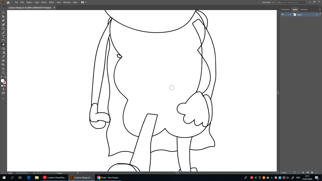
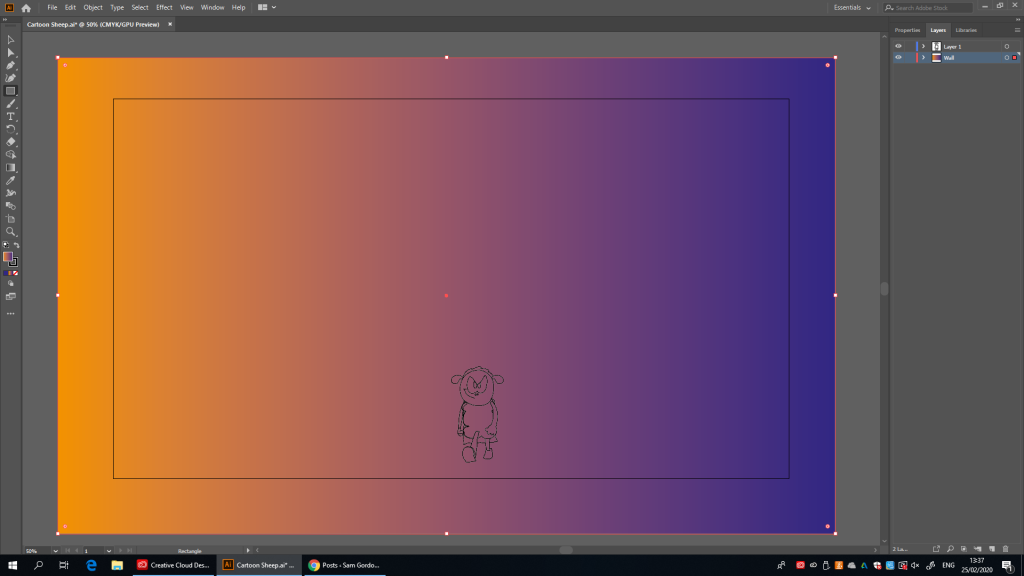
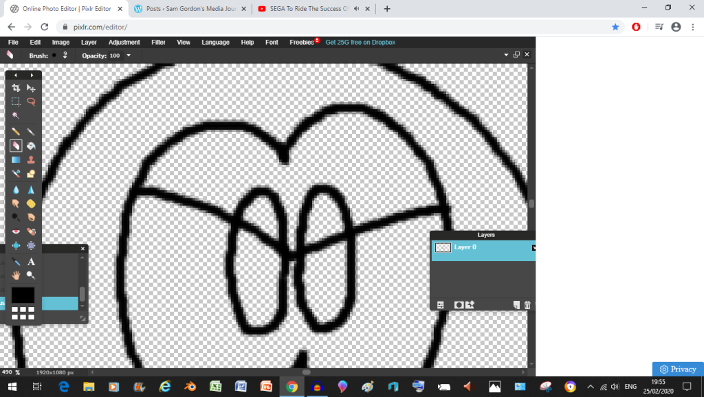
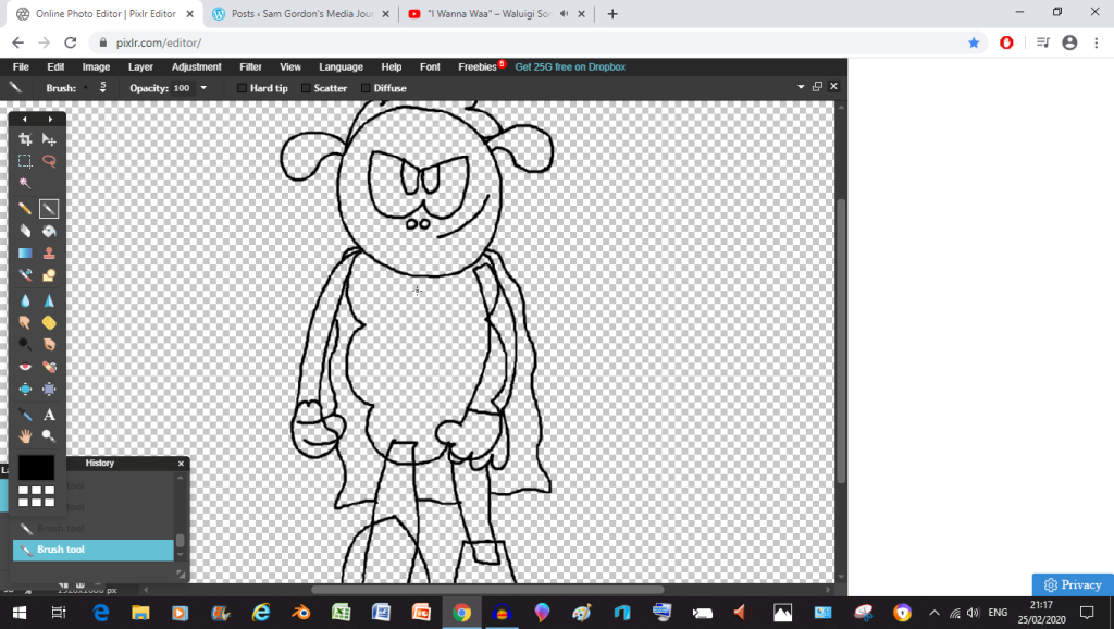
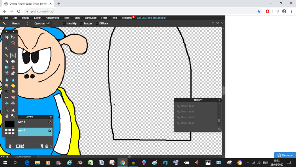
After experimenting a little bit with the tools it’s off to work, as you can see here the first character I tried to do was Super Sheep because that boy is the main man of this operation. (besides Billy)except because I used the path tool, any erasing I do will alter the line work in strange and unexpected ways (this isn’t a problem in Pixlr)as you can see here, some of the erasure has gone and left a couple of unintended gaps in the whole thing (I.E: The head), I’ll have to alter the paths to fix thisright now I’m focusing on fixing the bugs with the lines (which I’ve been doing since before this screen shot
and Now, I’m off to actually design the rest of the poster because I might want to work on these characters later (mainly because the character of Super Sheep has caused more grief than expected), maybe I’ll draw them up in Pixlr and figure out how to Vectorise them from there
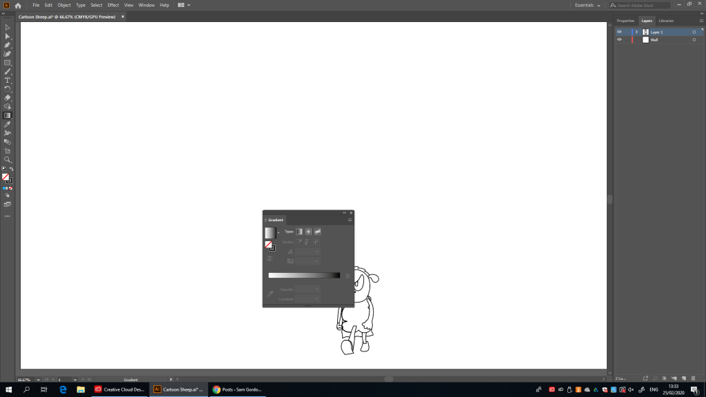
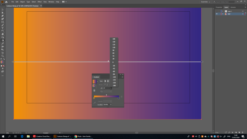
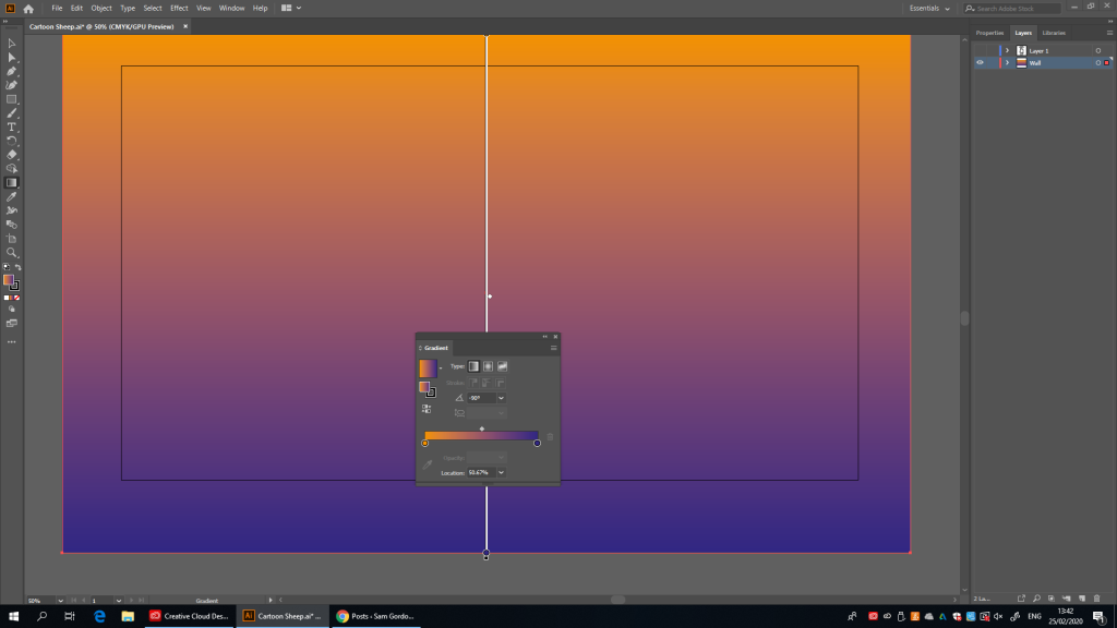
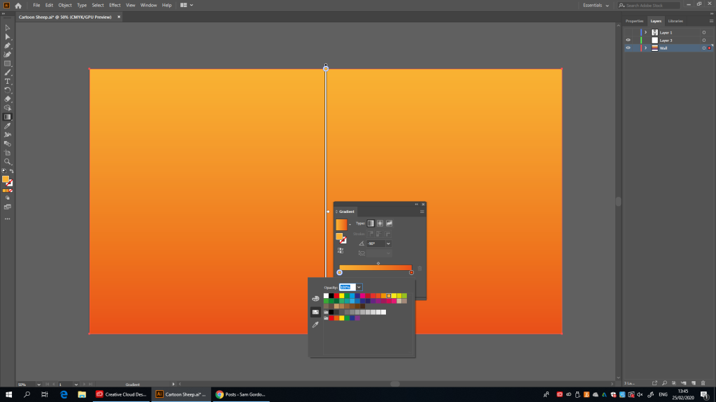
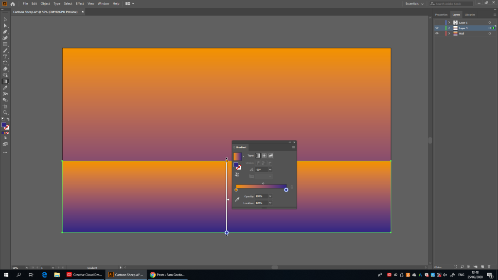
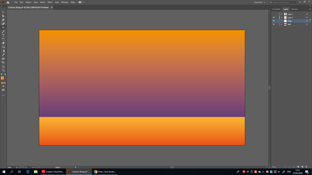
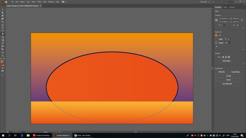
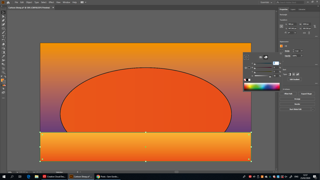
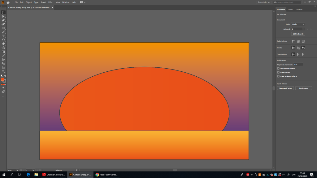
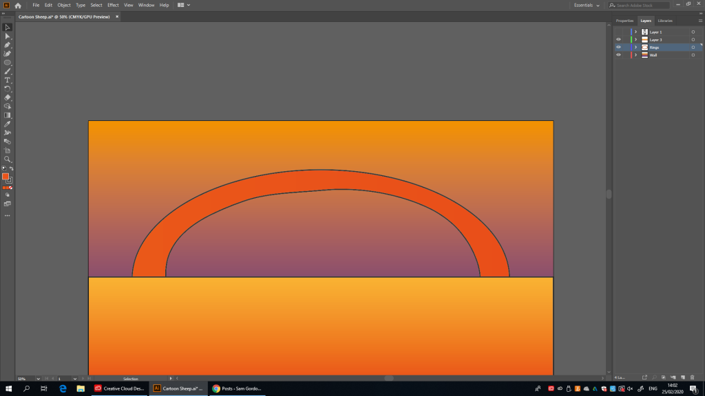
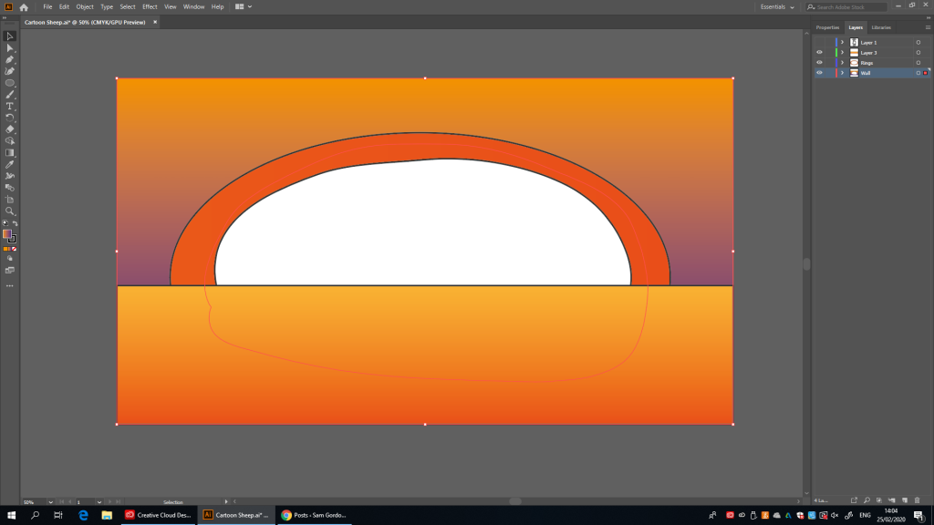
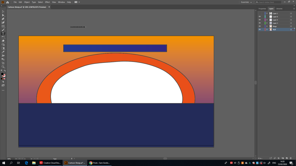
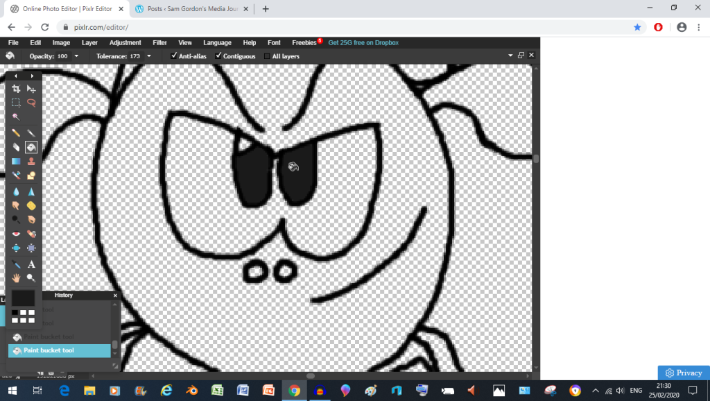
so right now I’m adding in a new layerhere, I’m configuring the gradiant tool so that I can get it to the colours I want the wall to be (Dark Blue On The Bottom and Orange on the top)there we go, looking clean even if it’s a bit purple-ish (which I think might actually be better to be honest)ok so as it turns out, this works nothing like Pixlr, though I do like it because it actually creates a new fill for your shapes and suchso after trying and failing to rotate the square I discovered that I can rotate the gradient directly, this seems helpful…but it looks a bit slanted once I rotate it 90 degrees (probably because I did something wrong during one of the steps)so for the floor I’m going for a nice dark to light orange gradient (until I realized I was editing the wall like a little ninny)so as soon as I made the real floor I’m now pulling a take 2 on the gradientthis design might start looking just a touch trippy at the moment, but don’t worry, once the ring comes in It should tie everything togetherright, this time we’re using the circle toolbut first I need to change which shade of orange I’m using so that it doesn’t blend in with everything elsethere we go, nice and contrasting (you can see it)wait, what? the stroke property actually adds a nice outline to the selected object? that’s neat, maybe I’ll use it on the floor too just for good measurealthough I should change the the line colour from pure black to gray so that you can see the character outlines more clearlythere we go, a subtle differenceok, this isn’t good (Pixlr never erased all the layers at once like that)we’re doing take 2 up here folksmuuuuuch better, now I just need to get rid of that piece of wallaaaah yes, that’s much better
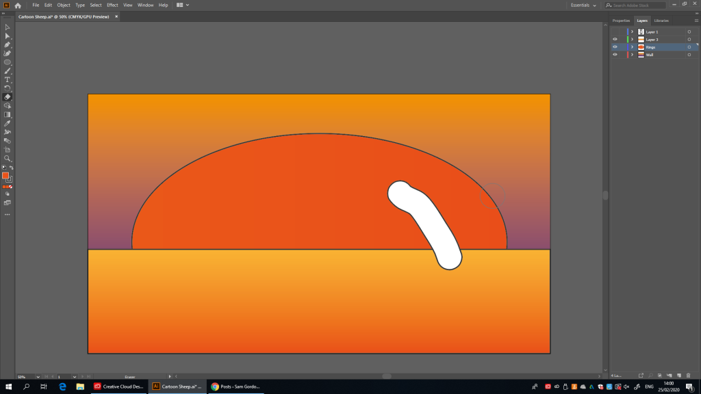
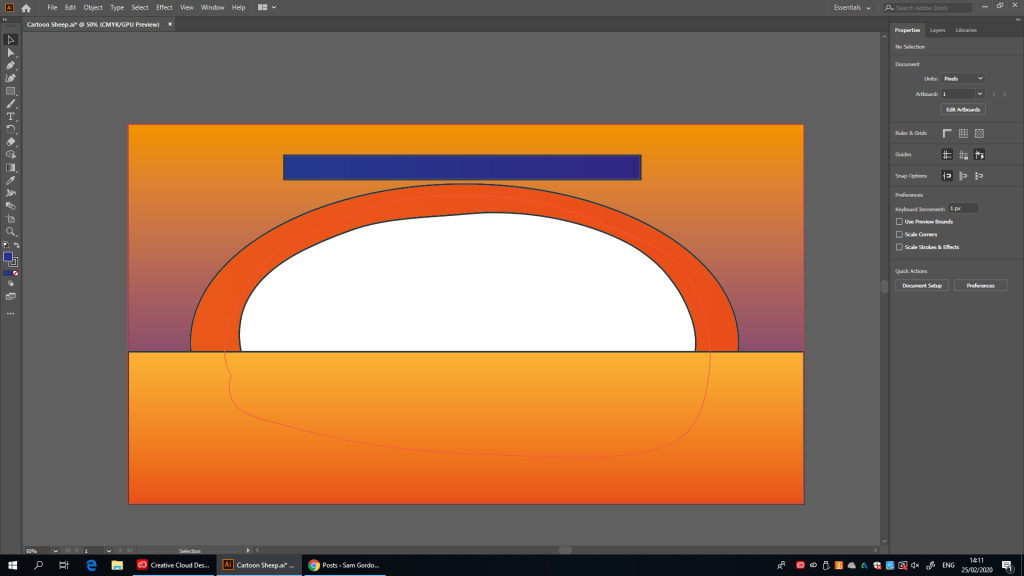
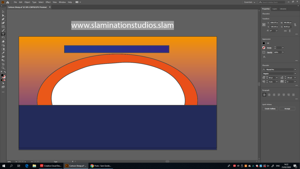
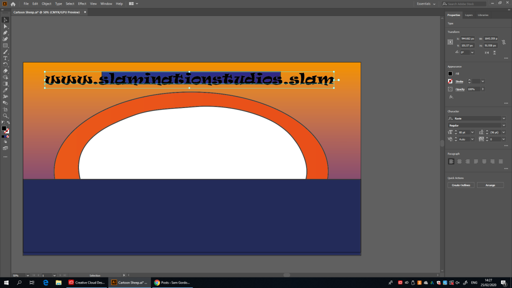
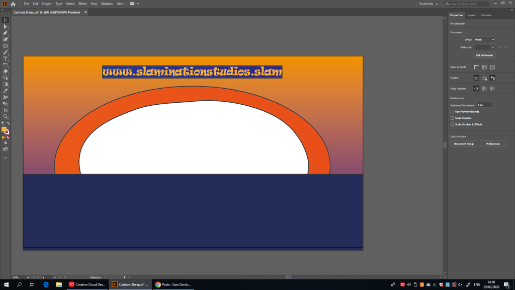
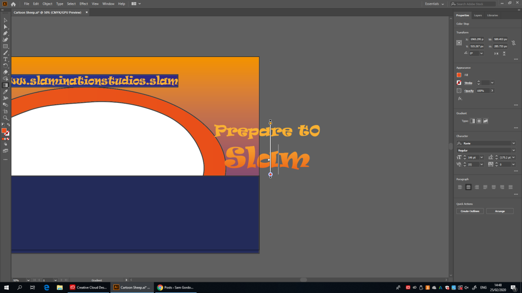
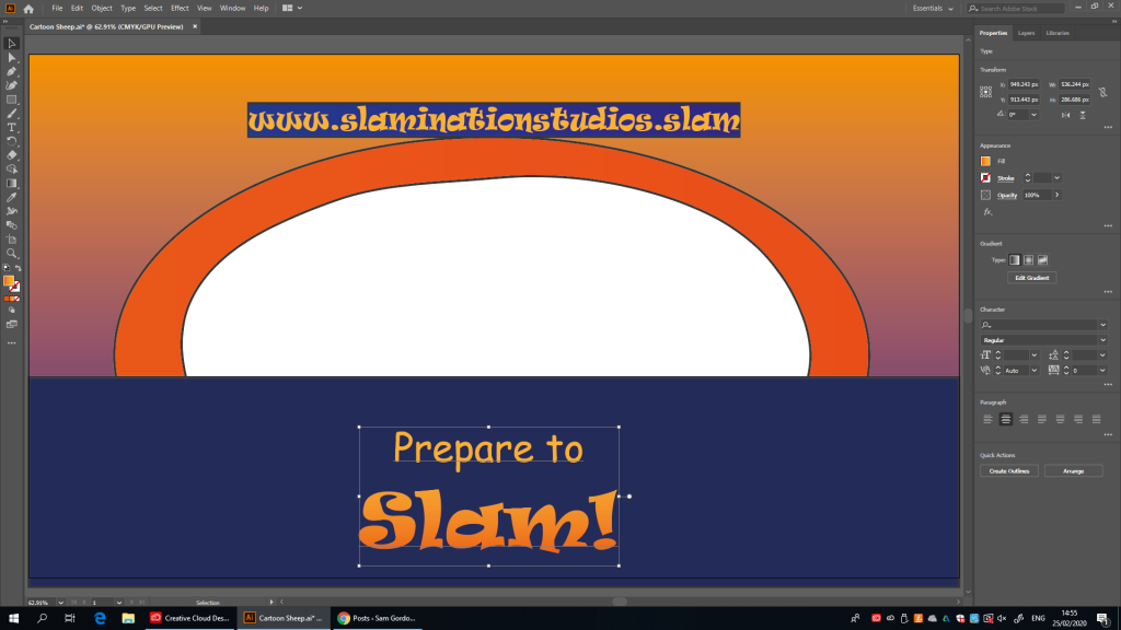
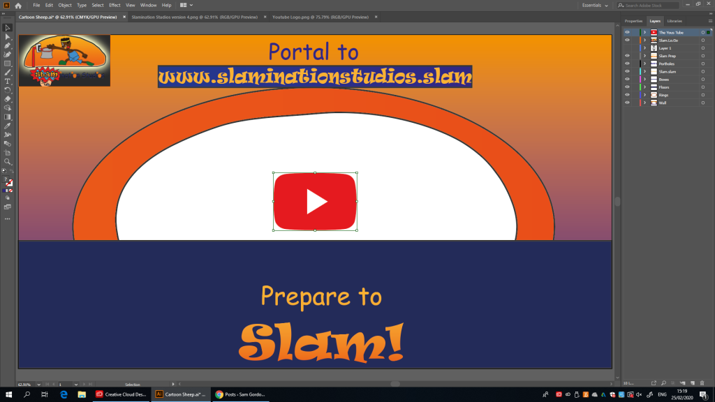
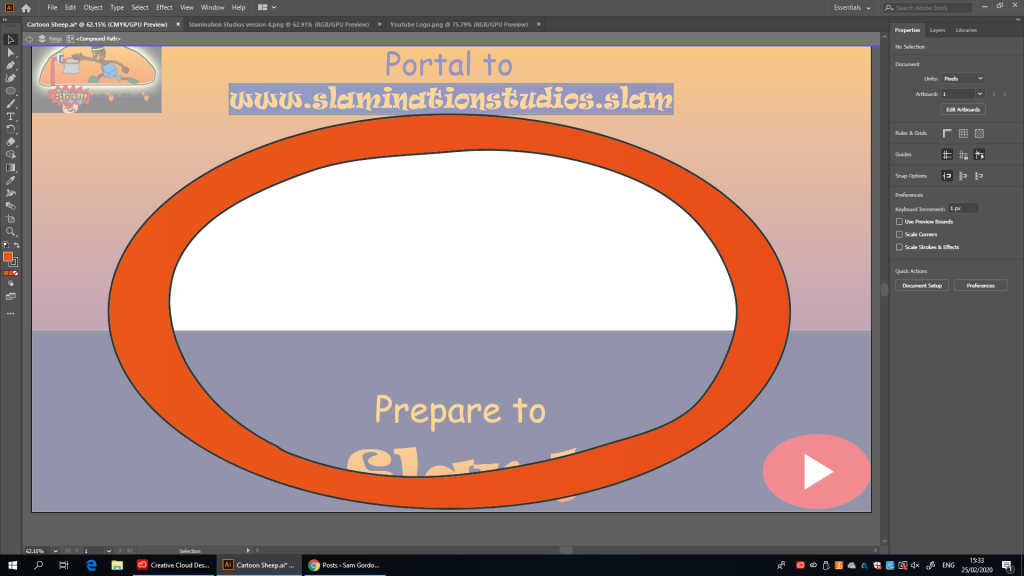
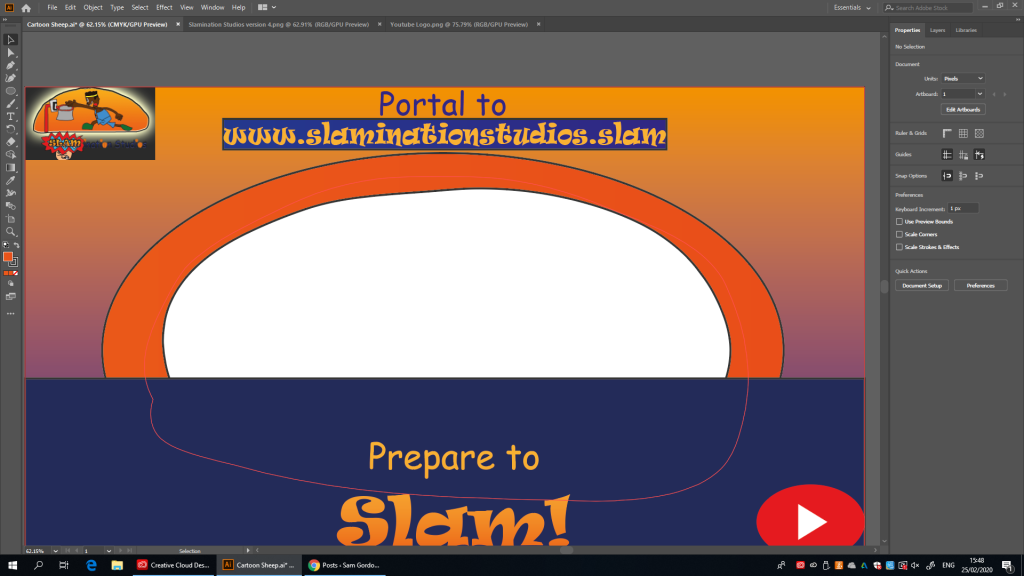
now in this screen shot I used the erase tool to erase just the wall it didn’t affect the ring because I selected just the wall, had I known this earlier I could have taken care of the ring in one take, but enough about how weird the erase tool is on this software, let’s work on the sign to the fake website (well, it’s fake for now anyways) http://www.slaminationstudios.slam
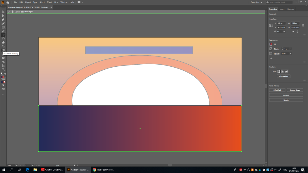
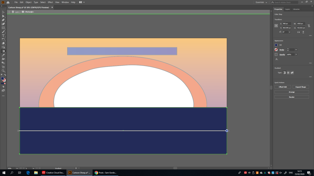
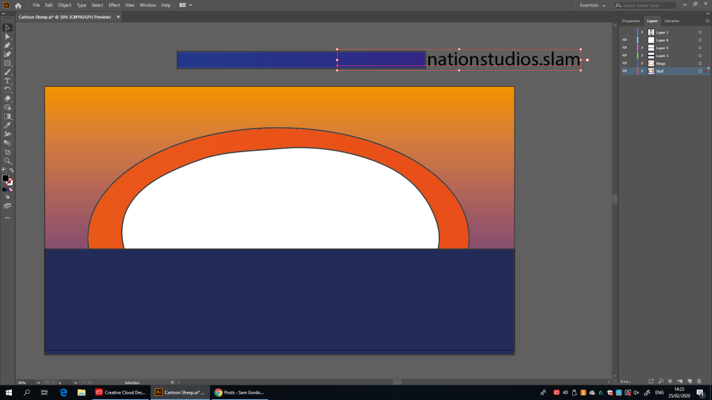
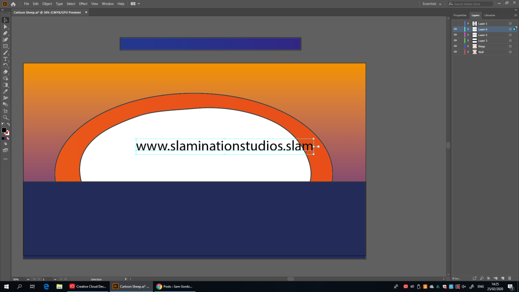
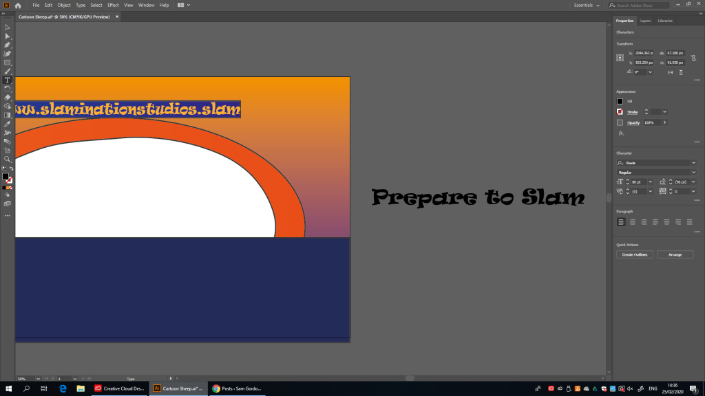
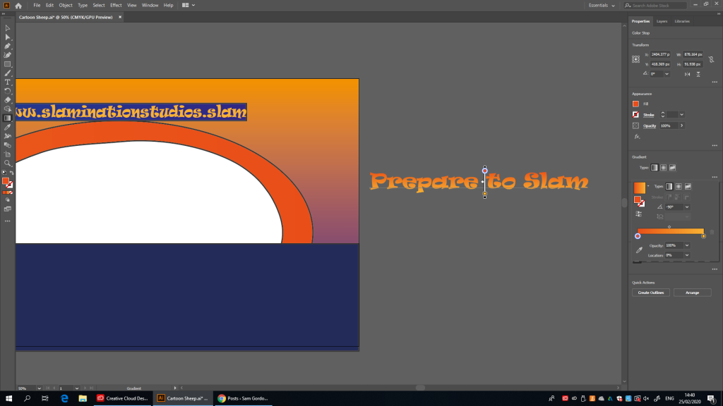
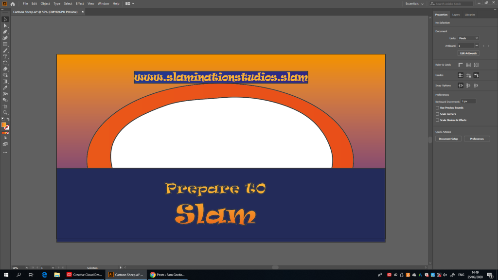
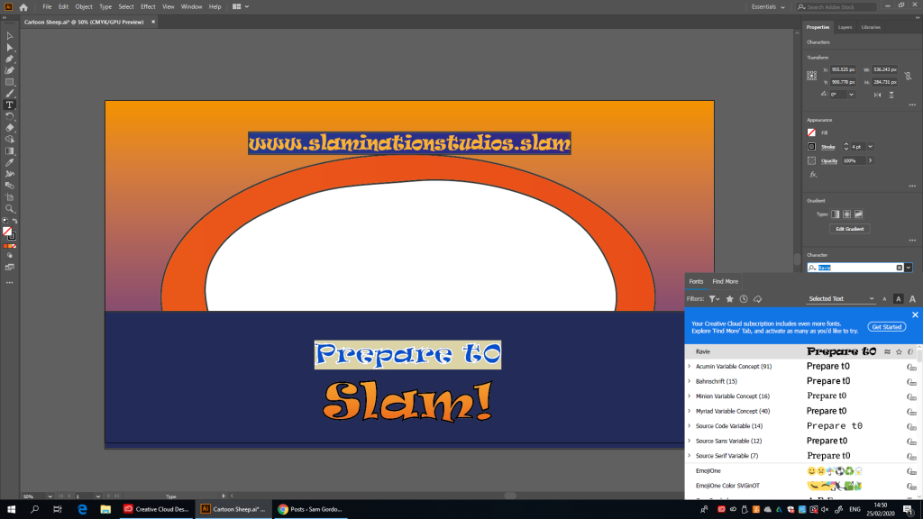
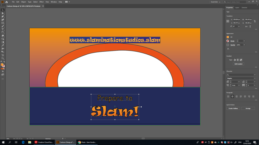
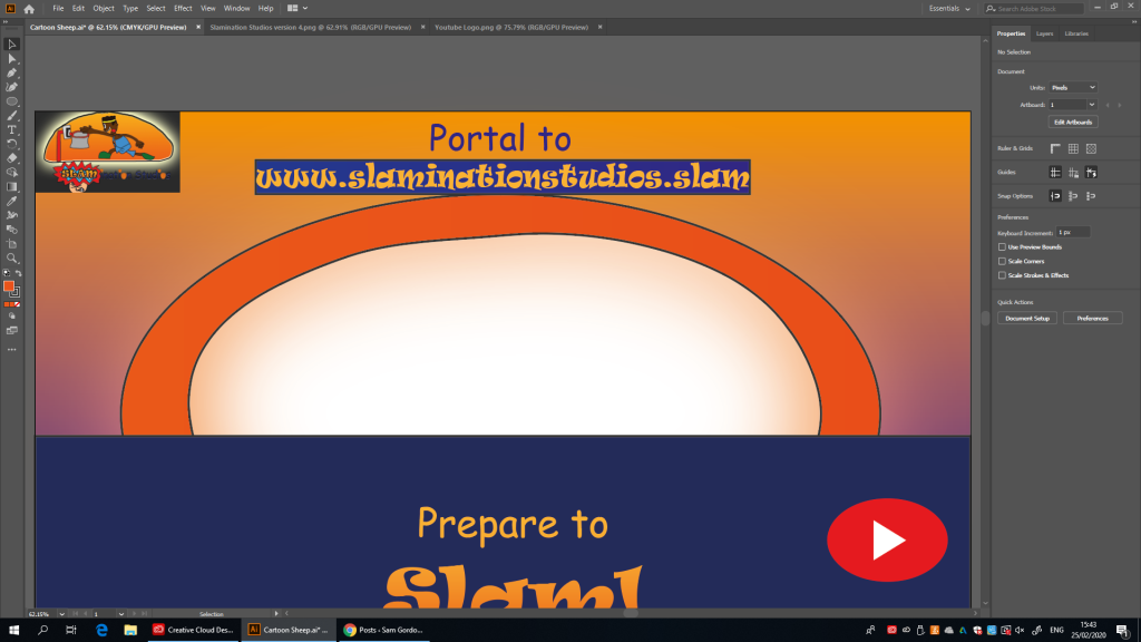
and just like that, we’ve got the box done, now it’s text timeSo I just realised I was meant to give the floor a dark blue colour once I looked my design, and now I’ve tried to break the gradient curse but to no availwell I didn’t break the curse, but it is dark blue now soooooooo, yeahnow that the visuals are done (with the exception of the characters and the logos) now it’s time to get that text done (Comic Sans, Ravie. It’s go time)huh, that text is looking mighty small, I’m going to take some time to fix thisuuuuum, ok then? if that’s how one changes the size of the text in this softwareok, never mind, I found the side bar for that instead (phew, that was close)hold up, I might need to re-order thathooray for cutting and pasting, they’ve done it againhuh, what do you know, it fits (the outline’s a bit ugly though)ok, never mind, changing the font to Ravie made it not fit anymore, now I have to downsize the whole thingthere we go much betterhey cool, I managed to use the side bar to change the text coloursand years later, the orange gradiant gets a second go around (it better not mess everything up)oh, the Gradient seems to have disappeared (maybe I can bring it back)it took a little bit of fiddling around but I’ve finally got the hang of getting gradients onto texts, I just had to remove the regular fill to get the gradient for some strange reason (Probably a software thingthat’s a strange place for a gradient tool, but heywe’re doing it Jefferyok so it seems the outlind has created something gross lookingbut first I’ve got to get the “Prepare to” part to comic sans and we’re good to goafter correcting a mistake where I accidentally wrote a 0 instead of an o, I can thoroughly conclude that the outline is garbage herehey, that’s not half bad, that’ll teach me for trying to put outlines on everythingand now I’ve put in the “Portal to” above the box and I’ve got to say, I think it looks good against the background here
So far I think Illustrator is rather perplexing with how it does things (I.E: Certain tools being in different places depending on what object you’re selecting and even the way the eraser works) I must say I think I’m producing some pretty ok results for a first real project using it (though I much prefer Pixlr in terms of drawing characters), now I just need to hit the ground running by importing the images (and making new poses for all the characters and finally giving Antler-Man a design of his own after all these years)
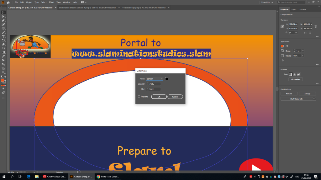
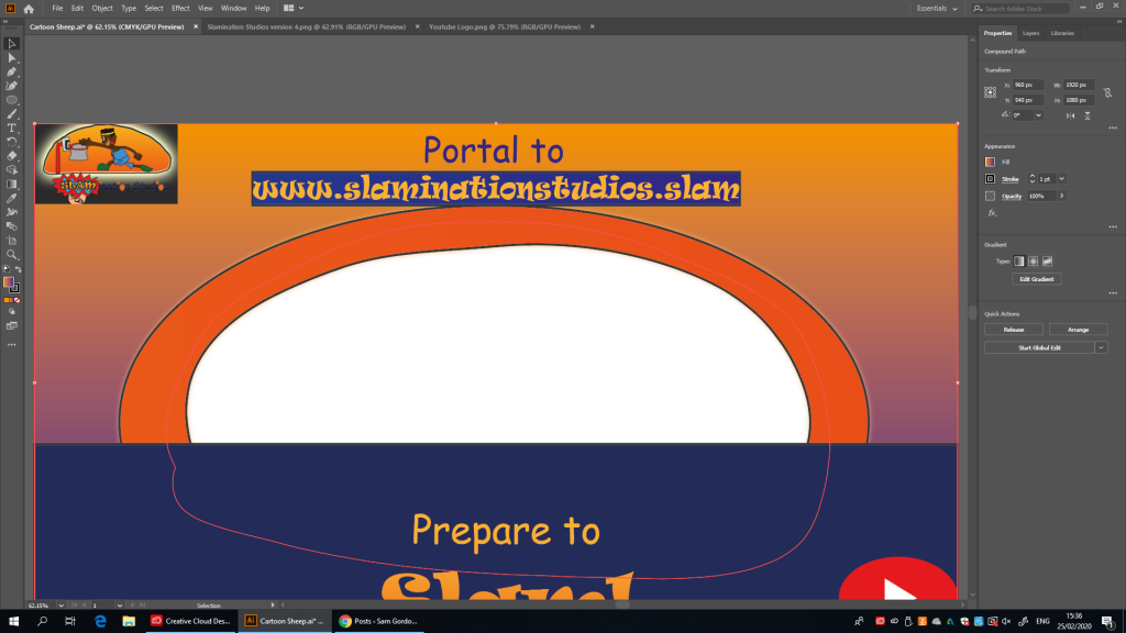
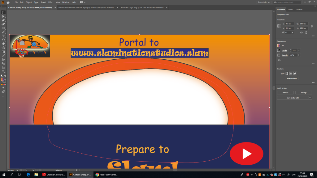
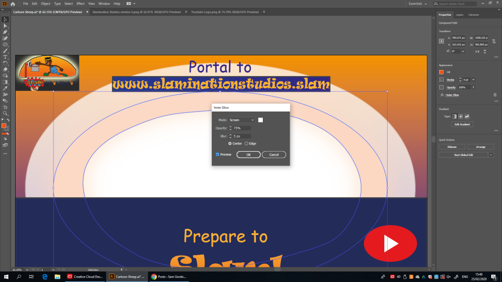
but first I’ve got to save my work so farok, so I’ve pasted the logo for my Studio in, and now I want to figure out how to vectorise it so that I don’t have to worry about pixelationalthough I can’t seem to find the “Vectorize” buttonso my tutor just told me I’d have to re-do the whole thing over again if I wanted it to be a vector (and that I didn’t even need it to be a vector) considering it’s so smallwe did it, the YouTube Logo is in! pop the champagnethat’s not good, I’ve got some white to remove now, unless……what if I made a mask for itso I found a different Trim mask tool to the one I was looking foroh, there it istake that white corners, Now I’ve made YouTube’s new Easter variant for them (they better pay me royalties every Easter for this)and that’s everything that isn’t the characters done, now I need to actually get them done (and that might be a time consuming process in this software because PATHS!)but then again, my design that I made did call for a glowing ring so maybe I should do that firstnow to add some glowtoo subtlethere we go, but I’m not sure about the colourThat’s bettertoo much Inner Glowright, we’re canceling Inner Glow’s graduation partyand after attempting to do 3D I got a message about there not being enough Random Access Memory and now my glow is ruined (so much for calling for a glow)
Now all that’s left for me to do is create the characters themselves, maybe I’ll do that in Pixlr and then put them in from there (because It’ll be so much easier than using PAAAAAAAAATHS!)
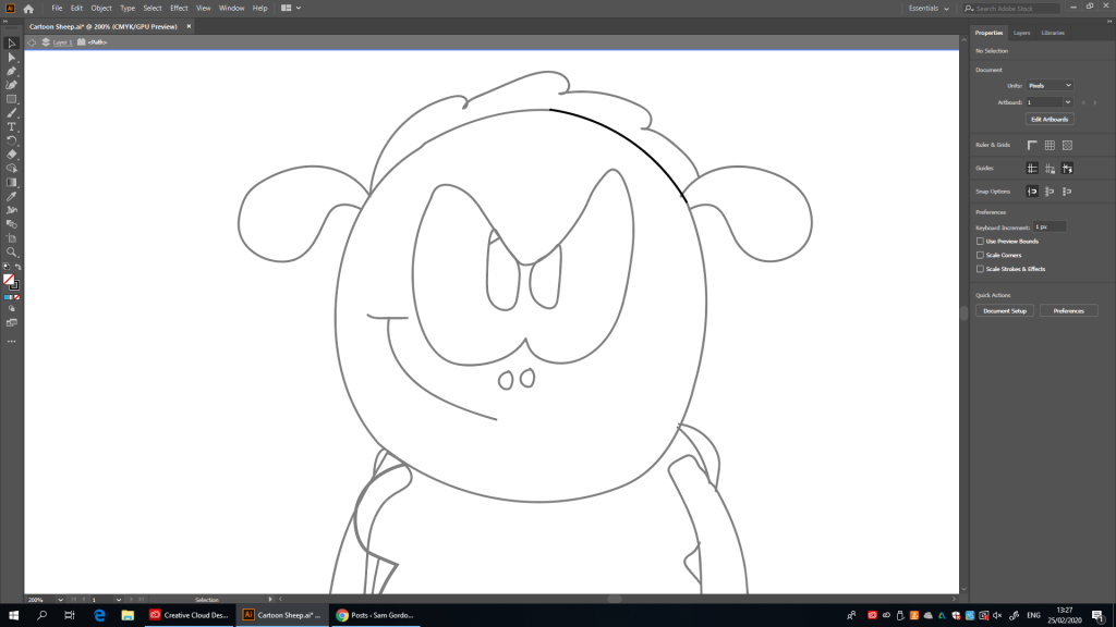
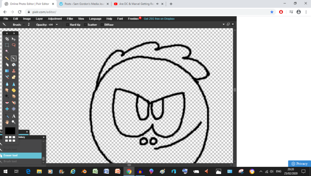
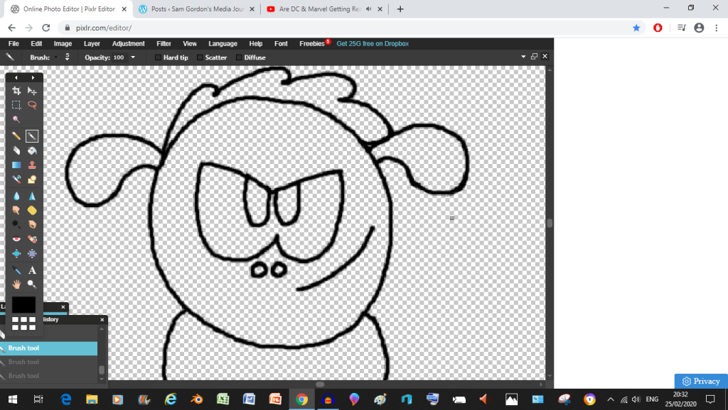
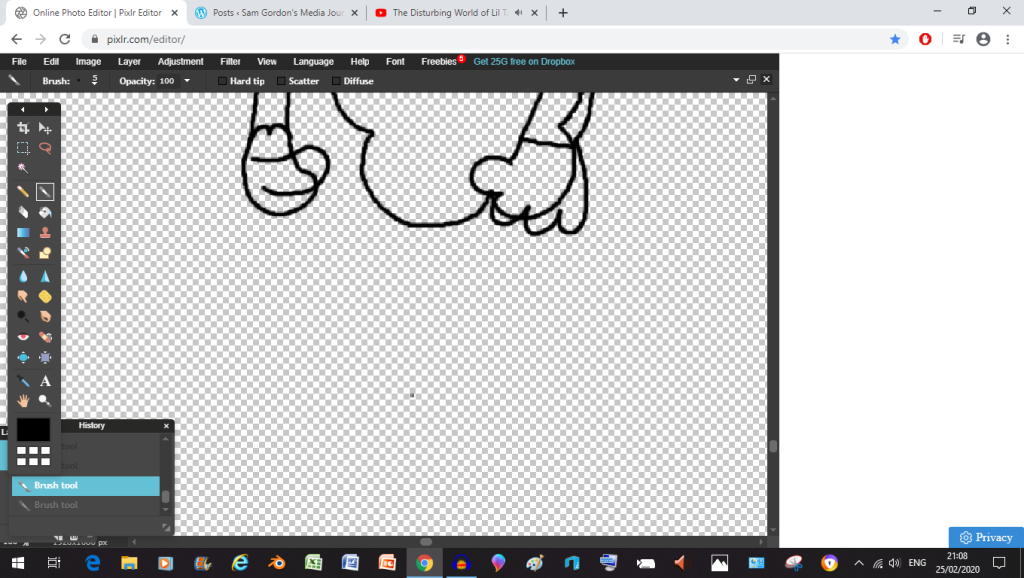
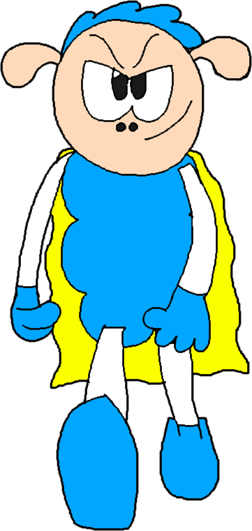
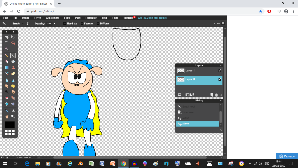
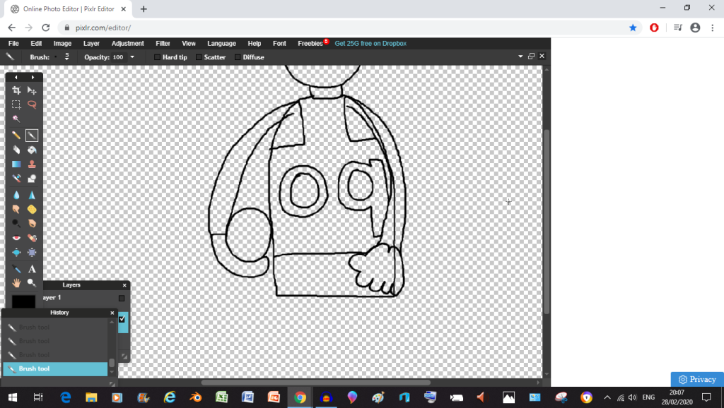
there we go, much better, right now I’m doing Super Sheepand already it’s looking better than the Illustrator versionand now we’re going to erase a piece of the eyeswe did it kids, the eyes are completeand after a million attempts I’ve got the wool just rightok, I’m trying a new approach for the earsnaaah never mindwe did it kids, the ears are doneok so I changed the mouth slightlyit’s time to figure out how to do more walkingwe did it, we did the legsand Now I’ve just finished up his cape it’s cleaning time
now the final major decision I had to make was whether or not Super Sheep should have eyebrows, the reason I bring this up is because sometimes I’ll give him eyebrows, and other times I wont, as you’ll see below
Brows
Brows
No Brows
Brows, but this time he’s with Copyrighted characters, so we’re gonna get sued
I’m choosing Eyebrows here because most of the other Super Sheep stuff has eye brows anyway
but now it’s colouring timeand just like that, a better result than using PAAAAAAAAAAATHS!yeah baby
You know, I actually like using Pixlr to draw characters more than Illustrator because of the relative speedyness (if you call a couple of hours speedy) and how I don’t have to worry about PAAAAAAAAAAAAAAAAAAATHS! Sorry, I lost my cool there. Anyway, when looking back on this one, at first I thought it was worse than the Illustrator version but as time moves on, I’m slowly thinking this Pixlr version is looking way better than what the Illustrator version ever could in my humble opinion (I know real professionals would trump my work reguardless) because in Pixlr, you don’t have to worry about the PAAAAAAAAATHS changing mid erase. On the other hand, I will admit that with Pixlr I can’t make vector images like I can with Illustrator, but I think this drawback is worth it for a wannabe cartoonist like me because I don’t have to worry about PAAAAAATHS messing up once I make even the most minute changes.
The next Character I’m thinking of doing is Billy Billson (you know, the studio mascot)
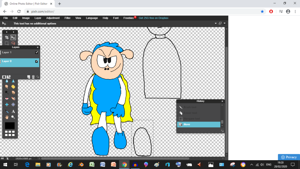
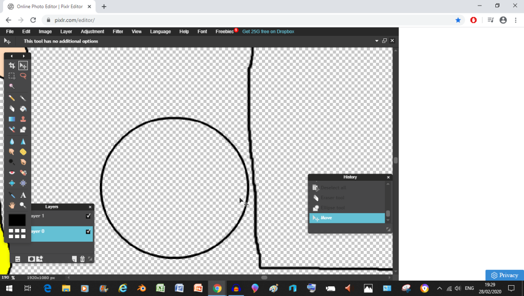
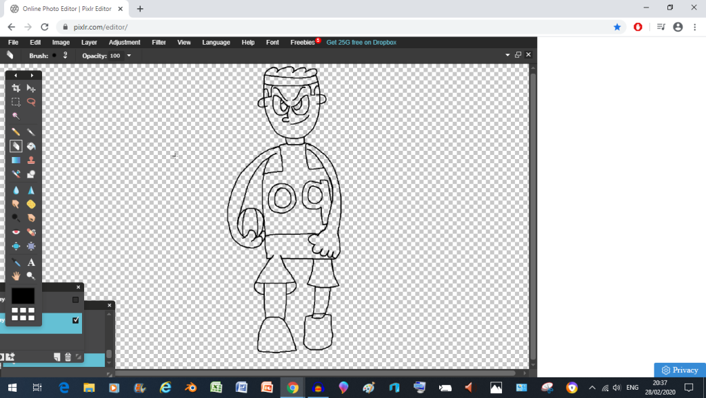
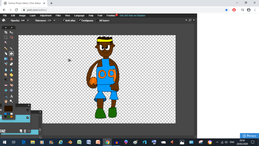
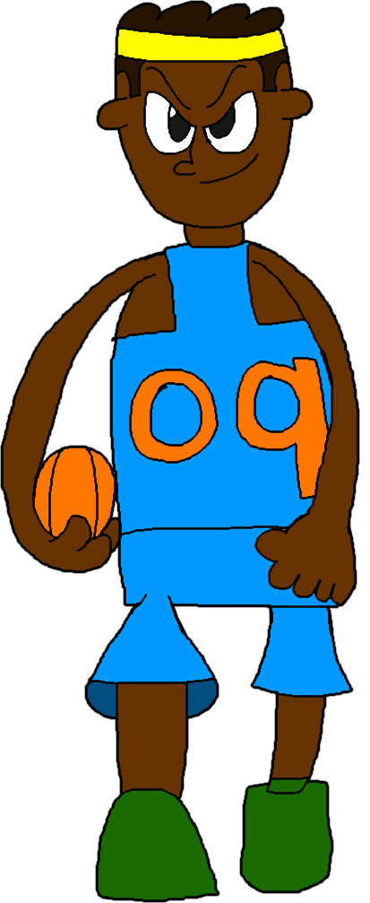
but first I need to copy the Super Sheep over so that I don’t make billy shorter than the sheep by mistakeas you can see, I’ve managed to use Super Sheep as a reference for how much taller Billy should beand right now I’m re positioning one of his eyes to line it up with the other oneand right now, I’m re positioning his foot (which I traced over Super Sheep’s foot in order to make)never mind, the foot was garbage, I’ll come back to it laternow for the basketball, I used the circle toolyou know what I think I’ll do the arm before the ballthat’s looking a lot better nownow it’s clean up timeso now I just need to colour it all in and we’re donewe did it boys, cartoon basketballers have come backYeah baby, we did it
you know, I think this Pixlr, Illustrator Combo just might work out after all, but I have to do these characters quickly if I want them all in here (though expect at least some cut backs, sorry folks)
Up next will be Captain Cartridge, so stay tuned
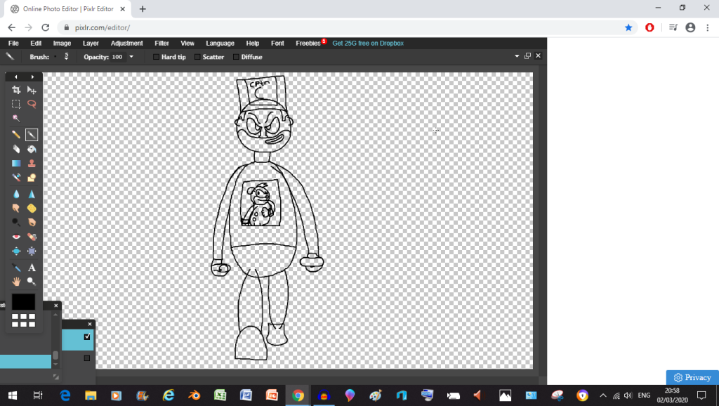
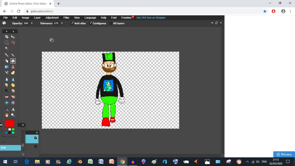
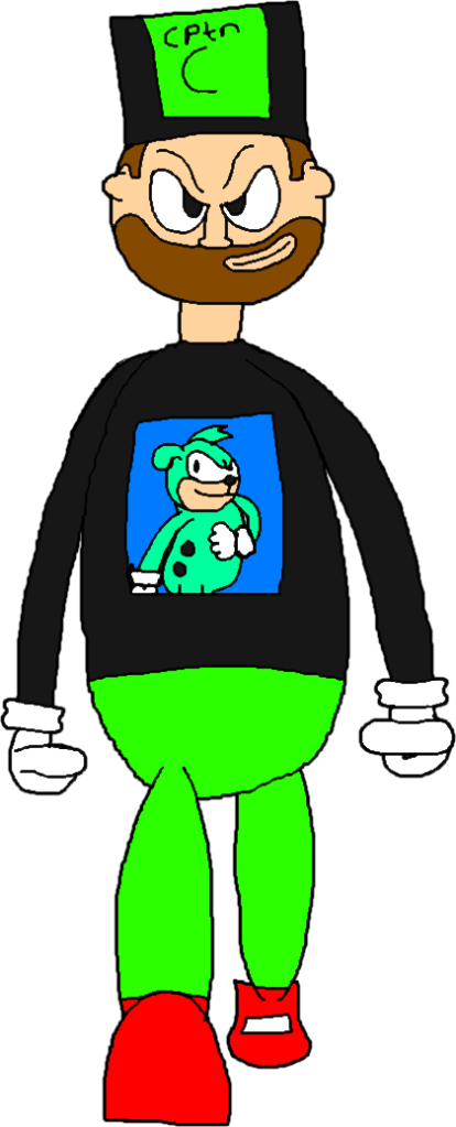
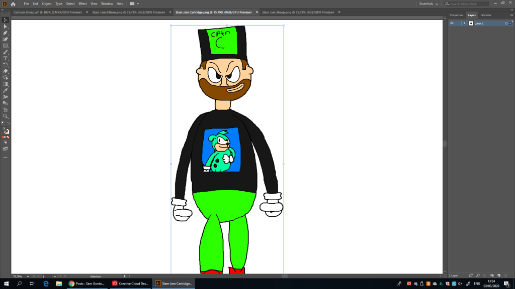
and now we’re going to use Billy as a scale reference for when drawing Cartridgeeyyyyyh, we did the hatand now we’re going to use cartridge as a reference model for this new cartridge (particularly with his shirt)uuuuh, maybe this’ll look better after being coloured inand now I have to go re-position the handok kids, it’s time to clean up everythingnow that clean up is complete (as well as adding a few extra features) it’s time to start colouring everything inand I’m using my reference Image to do it (which means I’m stealing the colours from there)well boys we did it, coloured cartoons are the wave of the futurelook at em, it’s almost great (thought the right hand could have used more work)
now unfortunately this may be the last character I do (remember those cut backs, yeah, so much for that fantasy project “DLC” I wanted to add in) because the deadline for this project is encroaching on me fast and I’ll be doomed if I don’t turn something in soon (Also, sorry about the lack of Video Games coming in to save the day again)
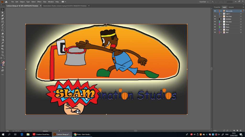
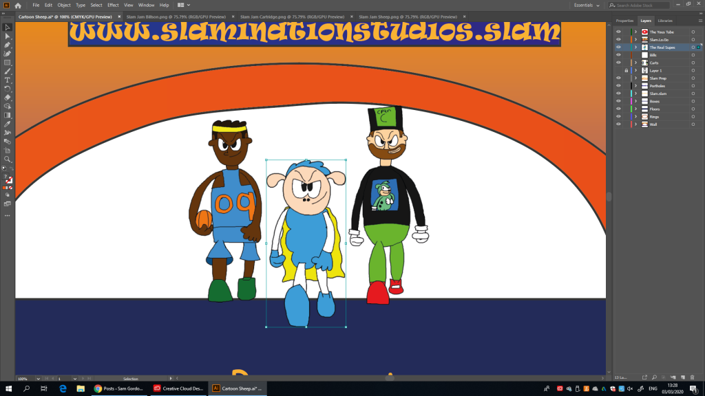
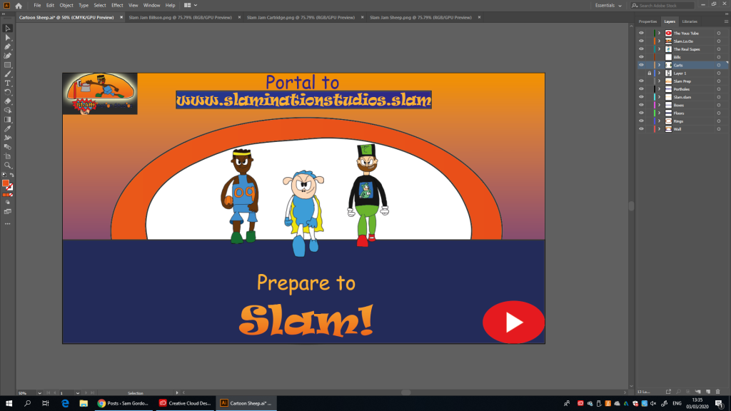
right now all that’s left for me to do is to put those characters in the thingthen I copy and paste the characters from their separate files so that I can add them in to the bigger posterexcept because of the cut backs (there were suppose to be 7 characters but now there’s only 3 because I don’t have time to do the rest) I’ve had to re consider the character’s positions in accordance with the rule of thirdsand after a little bit of re-tooling I’ve finally finished this thingand as it turns out I have to convert it (but I had help from a friend and a tutor so it’s all fine)and there we go, a hot shell of what was suppose to be (although it it pretty good looking I will admit)
I placed Billy to Super Sheep’s right (and our left) because it means he’s on the same side as the studio logo (where more people are likely to look according to rule of thirds statistics), and as for Cartridge, I placed him to Super Sheep’s left (and our right) because it brings him closer to the Youtube Logo (remember that Captain Cartridge video from a while back, yeah. References)