alright, now that production is over for this website I can sit back, relax and look back on the steps I’ve taken with a critical eye. I’m going to be honest, I thought I’d get this done much sooner than I did because I thought “heeeeeey, I’m doing a website, I can get much more ambitious here” which I did, to an extent because it’s not like I made a game with 5 levels in Dreams like I was originally thinking about, I didn’t do that one because it would be rather impractical for me to have the main bulk of production be done on software I can only use at home though for the Final Major Project it’s being arranged for me to have a PS4 with a copy of dreams brought in so that I can use it there too, so that’s going to be brilliant for me because I can get more done and even do the whole project in Dreams (I’ve actually been working on a few assets at home I might be able to use ;D)

So how did planning go?
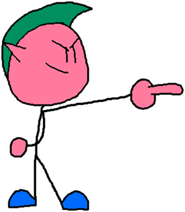
Planning was relatively simple, It actually allowed me to use a new technique when it comes to character design in the form of those rudimentary stick figures (so yeah, who knew stick figures could be so handy in character designs)
Unchanged 
Unchanged 
Minor Changes 
Drastic Overhaul 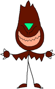
a few changes here and the there
The reason I did those was to give the presentation some visual flair but now I find that it’s helped guide me on the look of these characters even if some of them changed drastically, (looking at you Drawgax) I think I might use this technique in the future for characters I’m thinking about making
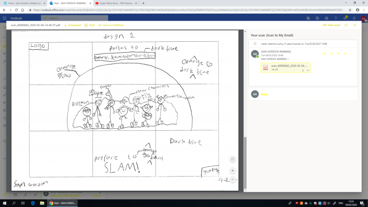
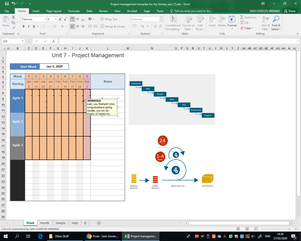
and then after that I decided to take the plunge and do a website because I felt it was easy and an excise to create new characters in the process I was wrong about it being easy, even with Wix I can’t imagine having to use my limited knowledge of coding from that Girl Geeks programming thing I participated in while I was in high school, as for the Project Management, I could have been better with updates (I could have done those updates on the Monday of each week instead of at the last minute on Wednesday (or in some cases Thursday morning before the taxi shows up)
Ok Mr Big Shot, how’d the actual Design go?
it went good actually, about on par with what I do personally to be honest except here I actually had to change a couple of the characters (I.E: Petra, Skulldrix and even The Drawgax)

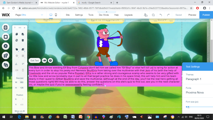
Elf Boy 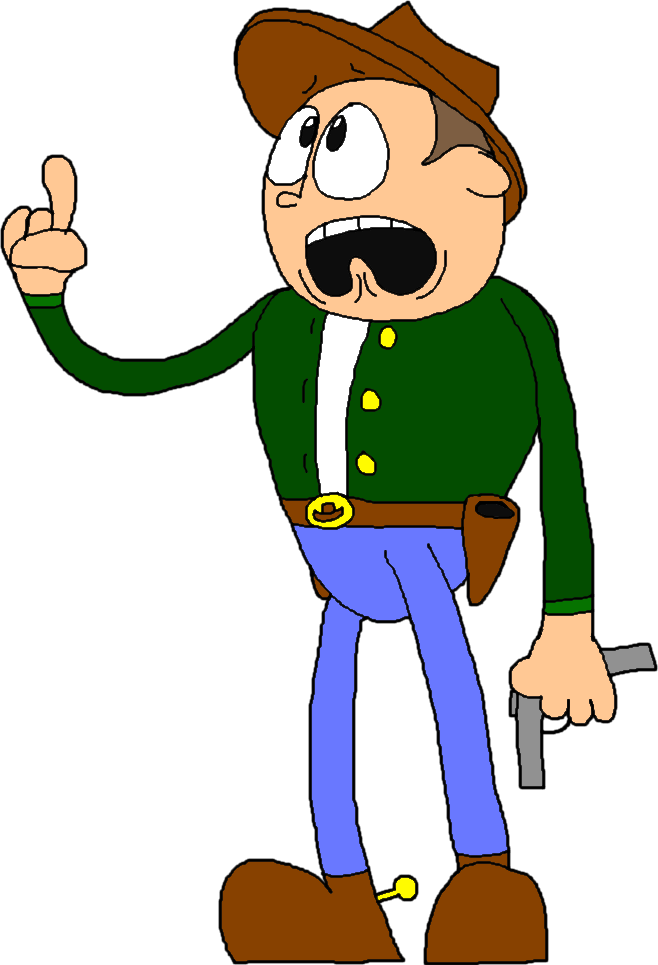
Cowboy Be-bop’s discount Woody doll 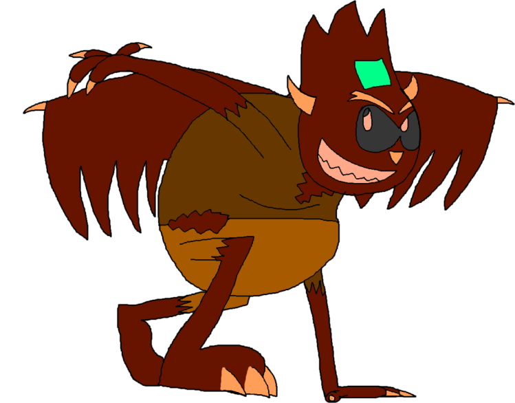
Too Edgy 
Teen Sensation 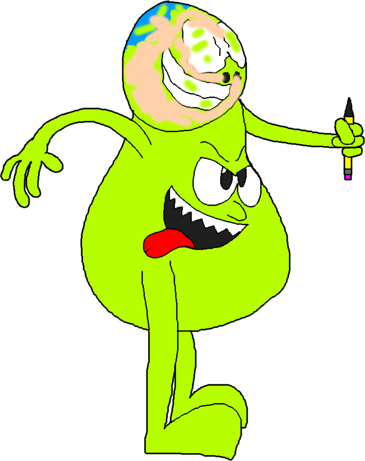
Fat Teletubby 
Adult Popstar 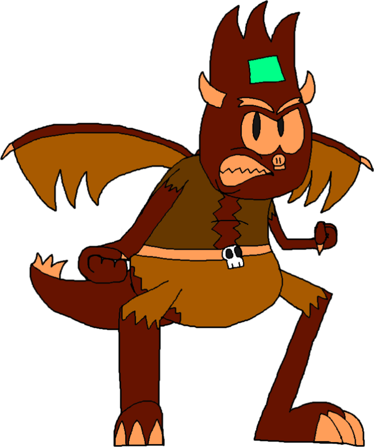
Just Right 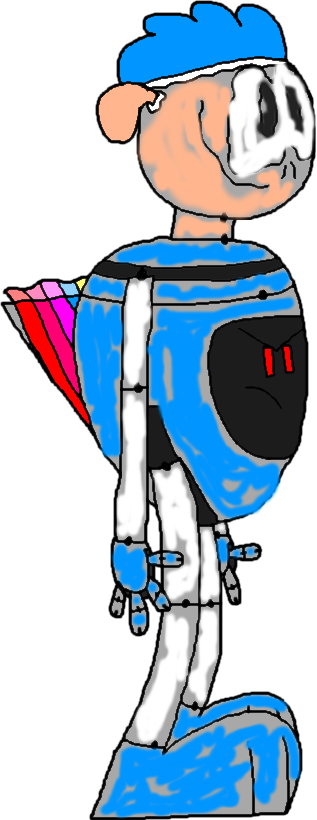
Best Re-Design out of the lot
Speaking of The Drawgax I think that one was saved in the redesign because now instead of a big fat Teletubby that runs around going raaaaaaah, it’s a robot species that’s heck-bent on destruction (which I think might be a much better concept) my only wish was that I saved the gray Drawgax as a template first and then added on the Super Sheep reference to it afterwards, that would have been a good Idea, had I thought of it at the time
In terms of Petra, I’d say she’s one of the more important character designs as she’s helped me get over a particular hurdle when it comes to designing characters (at least for me), Female Characters, yeah, look across my blog and you’ll find it’s mainly a didgeri-dude convention (and with me being a dude, that might have something to do with it), but when re-designing Petra, it forced me to figure out how to do a proper female character, and to do that, I had some help in the form of one Audrey The Astronaut, because designing Audrey helped me figure out what I roughly wanted to do for Petra.

The key to everything The Door it unlocked

as for SkullDrix, or as he was originally called Badry, I feel like he was also saved in the re-design because his first design looked like this
and I felt it was too edgy for what I was going for which is a child friendly thing where cartoon a cartoon elf, cowboy and pop star run around stopping the bad guy (although if you get the questions wrong you’ll see their graves) so I tried redesigning him into something I felt fit what I was going for more and after a failed save of a previous redo, my 2nd redo ended up better (so maybe that failed save of the second re-do)
but all tricks to get you guys listening to Nick Jr content aside, I thought the skull motif I added gave it a nice touch and removing the Sonic.EXE style eyes has removed just enough of the edginess for him to become kid friendly.
As for Elfrix and Cowbredo? I simply thought they were designed well enough the first time around so I didn’t need to change anything about their designs (with a few changes from their stick figure counterparts of course)
and as for the Dreams made Backgrounds, I’ve got to be honest, doing the backgrounds was easy, it was getting the evidence onto YouTube for the sake of the blog that was hard, next time I do something like this I’ll need to make sure I give the videos names before uploading them to the internet the reason I didn’t do this was because I’d recorded so dang many (unless you’re the bonus backgrounds or the big 41 minute audio evidence video)
so yeah, this method where I use video games to make professional material for college also means I can easily blend my work time with my spare time, which also allows me to use this stuff in any personal projects of mine. (including a Super Secret Super Sheep game I’ve been working on those assets I mentioned earlier for)
Ok wise guy, how was production?
aaah yes, production. that was quite a ride let me tell you, but it was a ride that went smoothly for the most part (and I only finished it a week or two ahead of the deadline, hence this evaluation), although it did take a bit longer than expected (part of that one is on me and my P R O C R A S T I N A T I O N) because when I first got started on this surprisingly ambitious project (at least by my current standards), I thought “oh, it’s just a little website, how long can it possibly take?” All I can say is now I have a greater appreciation for web designers, not that I had a distaste for them, I just simply took what they do for granted. (and that’s just me using Wix, I can’t imagine having to code the whole thing using my limited knowledge from the Girl Geeks thing I participated in a while ago)
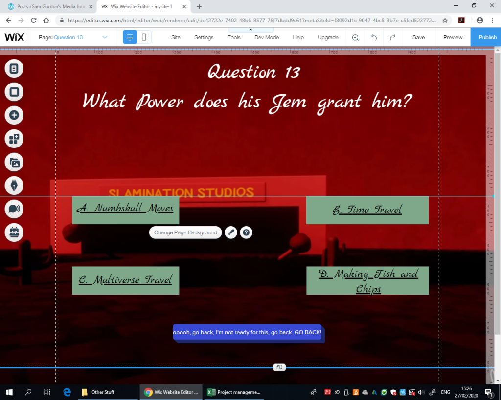
The Quiz ended up being one of the best and worst parts for me to do because on the one hand, it was fun coming up with the questions and the (in my opinion) witty options. but on the other hand, it got a bit mind numbing to do the links after a while because I was just clicking a few buttons over and over again to link the pages together (probably because it was an easy process to do considering I was using Wix), I was also able to learn that sometimes the best way to solve a problem (lets say inconsistent box sizes for the question options) is to take a while away from the problem and come at it later from a fresh angle
I’ll be honest, some of those last minute changes ended up being worth it because seriously, look at these comparison screen shots
My Original 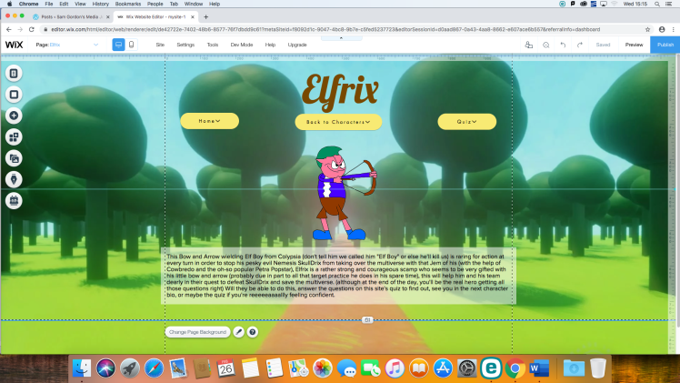
Tutor alterations 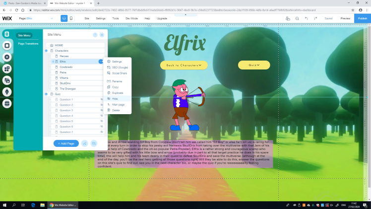
My final alterations
who knew that a little bit of spacing and some colour consistency could exponentially improve my entire website across the board, the more you learn am I right? (I’ll admit this plays a part in my new found appreciation of what Web Designers do)
So how was it overall?
Overall, I’d say this project was fun to do, even if it took longer to do than I expected, I learned quite a bit about the importance of web design and even how rudimentary stick figures CAN be helpful when it comes to character design given that they can also help me experiment with the character’s personality before doing the proper design, so that’s something I can utilize in future projects. (such as my Final Major Project and even my Personal work in the future) I was also able to build off of what I’d learned in high school when I made that “Medi-Pedia” website using Google sites although I think Wix let me do more of what I wanted to in terms of full page backgrounds rather than forcing me to use a certain template and by giving me a surprising amount of le-way for a free service that offers a premium version to be honest I thought there would be a smaller limit on the amount of pages than I ended up with. (and even then I didn’t actually reach this theoretical limit like I thought I would) My favourite part of the whole project was designing the characters with Pixlr because I could harness years worth of experience using it (as well as knowledge of character design) to create the new characters, and using Dreams PS4 to create the backgrounds because it allowed me to create relatively good looking 3D backgrounds really quickly and easily, and served as an excuse to showcase what the game can do
Now one of my least favorite bits was linking the answers to the correct pages because while it was easy, it got very mind numbing after a while (maybe if I did the links as I was doing the question layouts I wouldn’t have as boring of a time as I did doing it), another part I didn’t enjoy as much was creating the mock layouts because all I was really doing there was slap-dashing a potential layout together using pre-made assets (as well as assets I made) to save time (although I should say that this step is important because it allows me to have a frame of reference when making the actual website, so there’s that at least)
you know, I didn’t think making a website would be a so time consuming that I barely got it done a week ahead of the deadline, but that’s the thing about interactive projects like this, some of them just take longer than expected (though I must once again say I enjoyed doing this regardless of how long it took) but at the same time, processes such as design took me less time than I expected (probably due to years of experience) while actually putting the whole thing together took more time than expected (probably due to the amount of pages I ended up adding in the end)
Another thing I didn’t quite expect was when I did the test and it turned out I’d used less of the space than I thought I had…

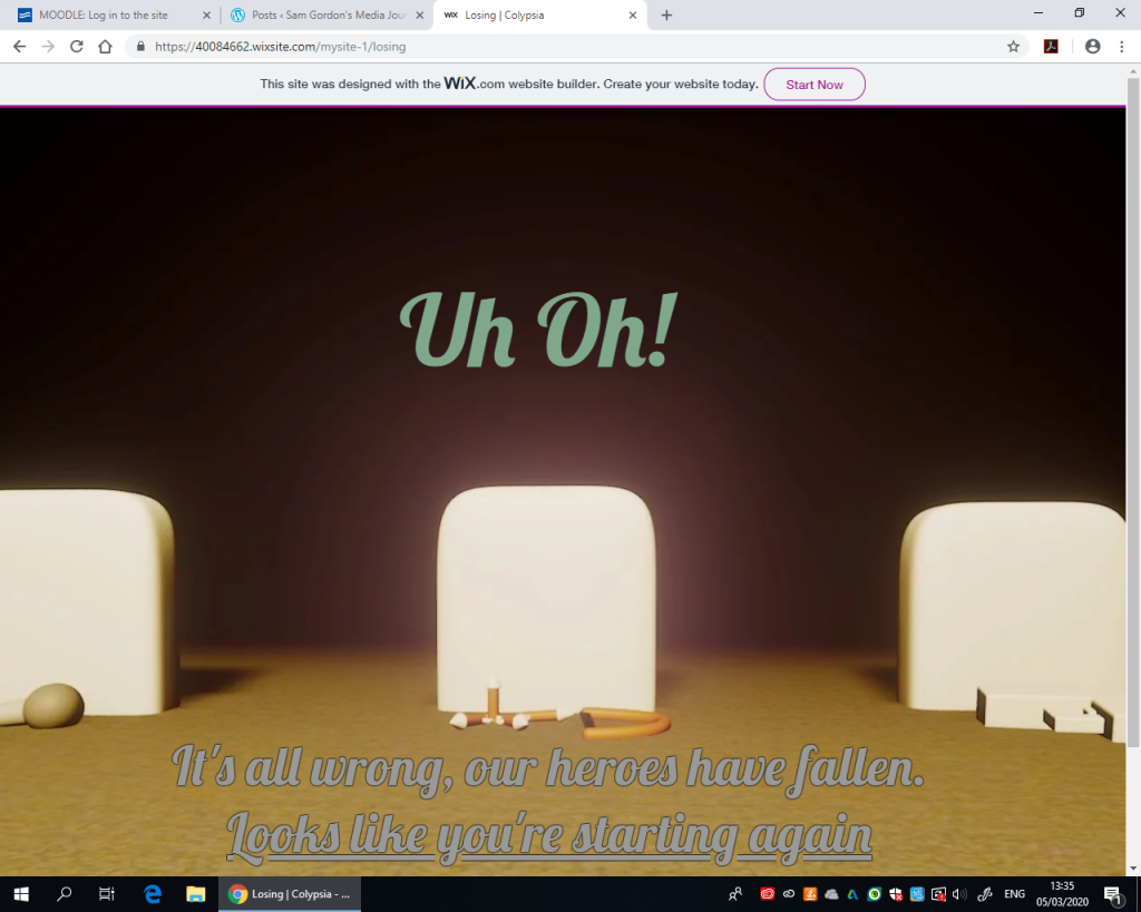
…OK, never mind, I ended up using less space than my testing phase lead me to believe, maybe if I published it earlier and tested that version earlier I’d have a rough idea of how much space I was actually working with (oh well, there’s always next time, and I can note this down as a Wix Oddity at least), so that happened, and on a slightly odd note, I’m looking at the gun in the losing screen and noting how it blends in with the graves, that’s something I’d have to fix next time I do a similar project to this.
if you wish to see the for yourself website yourself (and give some critiques), here’s the link: https://40084662.wixsite.com/mysite-1 (though I should warn you that the mobile version is terrible)
